Telling Their Story With a new Wine label design

My Roles

Market Researcher

Creative Designer

Brand Strategist

Project Manager

Discipline

Packaging Design

Brand Identity

Graphic Design

Client

Sobon Wine Company

Date

2024

Project
Sobon Wine Company approached me to develop a new line of labels for their estate wines, aiming to create designs that would stand out on store shelves while reflecting the rich historical culture of the winery. As the lead designer, I managed the project from initial research to final production. The challenge was to design a refreshed label that not only captured the essence of the family winery but also resonated with consumers. I conducted extensive market research to identify current trends and consumer preferences, created mock-ups to present to management, and ultimately designed a label that told the winery's story. Additionally, I ensured that the final design complied with all wine labeling regulations before delivering it for printing.
Constraints
In creating the new wine labels for Sobon Wine Company, I faced several key constraints. I was required to use the established winery logo without existing graphic standards, necessitating the development of a cohesive brand identity. Additionally, I had to incorporate a long-standing seal into the design.
The label shape needed to remain the same as the previous version to avoid new dye line costs. The back label had to include all legally required markings, including the California CRV mark and a barcode. Finally, the design had to be adaptable for both high-shoulder and low-shoulder bottles without a complete redesign.
rESEARCH
For my market research on the wine label design, I utilized three main sources. First, I explored online platforms to gather inspiration from the latest design trends and cutting-edge styles. While the winery desired a classic and traditional look, I aimed to incorporate eye-catching elements, compiling these ideas into mood boards for later reference.
Second, I visited brick-and-mortar stores where our wine was sold. This allowed me to evaluate the shelves and identify other wine bottles that aligned with the desired aesthetic while also standing out.
Finally, I conducted informal observations in the store aisles, analyzing consumer behavior. I noted that most shoppers either chose familiar brands or sought assistance from staff, providing valuable insights into decision-making processes.
Design
When it came time to start putting the design together, I had a wealth of photos, notes, and inspiration from my research that I began weaving together. I noticed trends right away in the styles, fonts, and colors used in the labels I had collected, and I began to piece together the brand identity that would serve as the foundation for my designs.

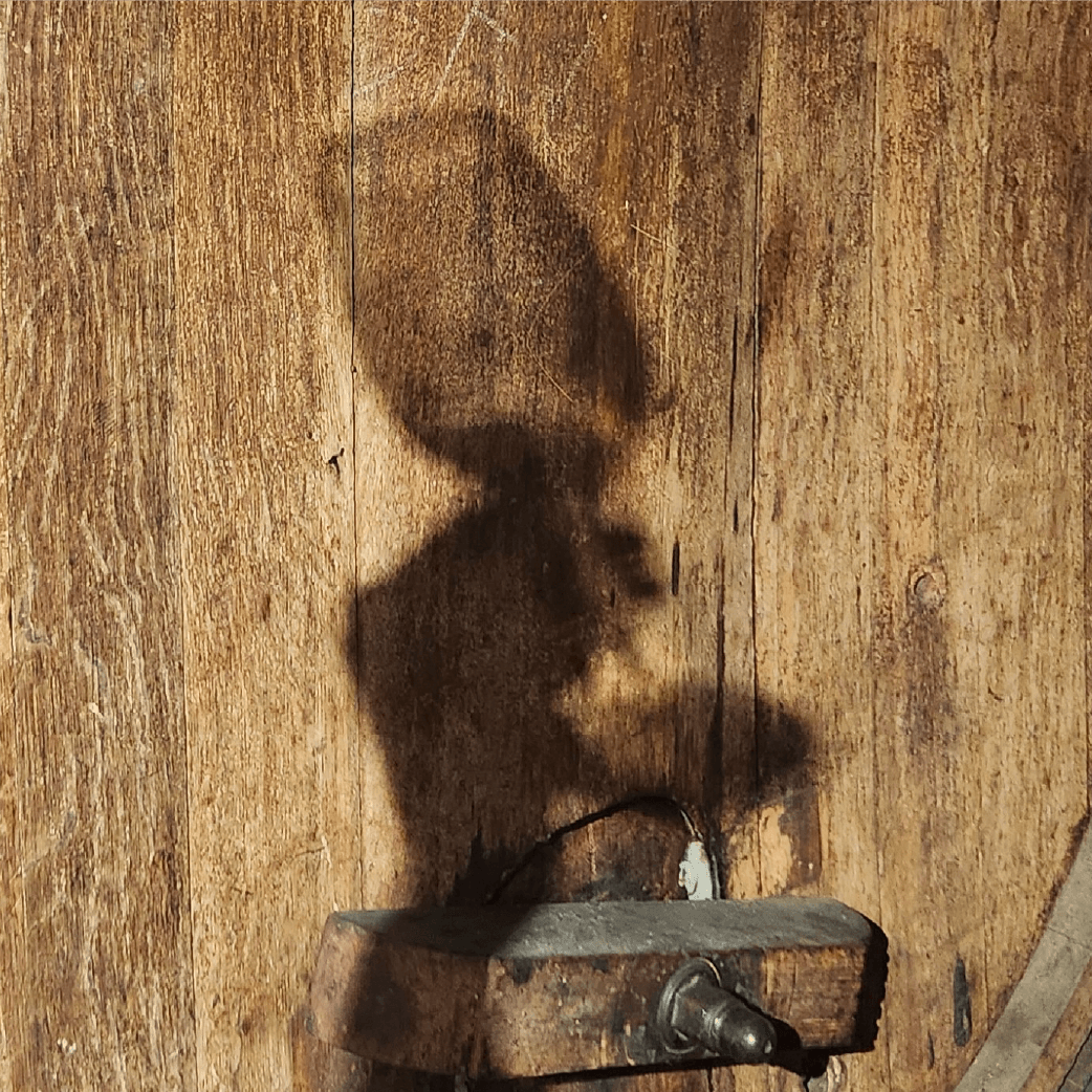
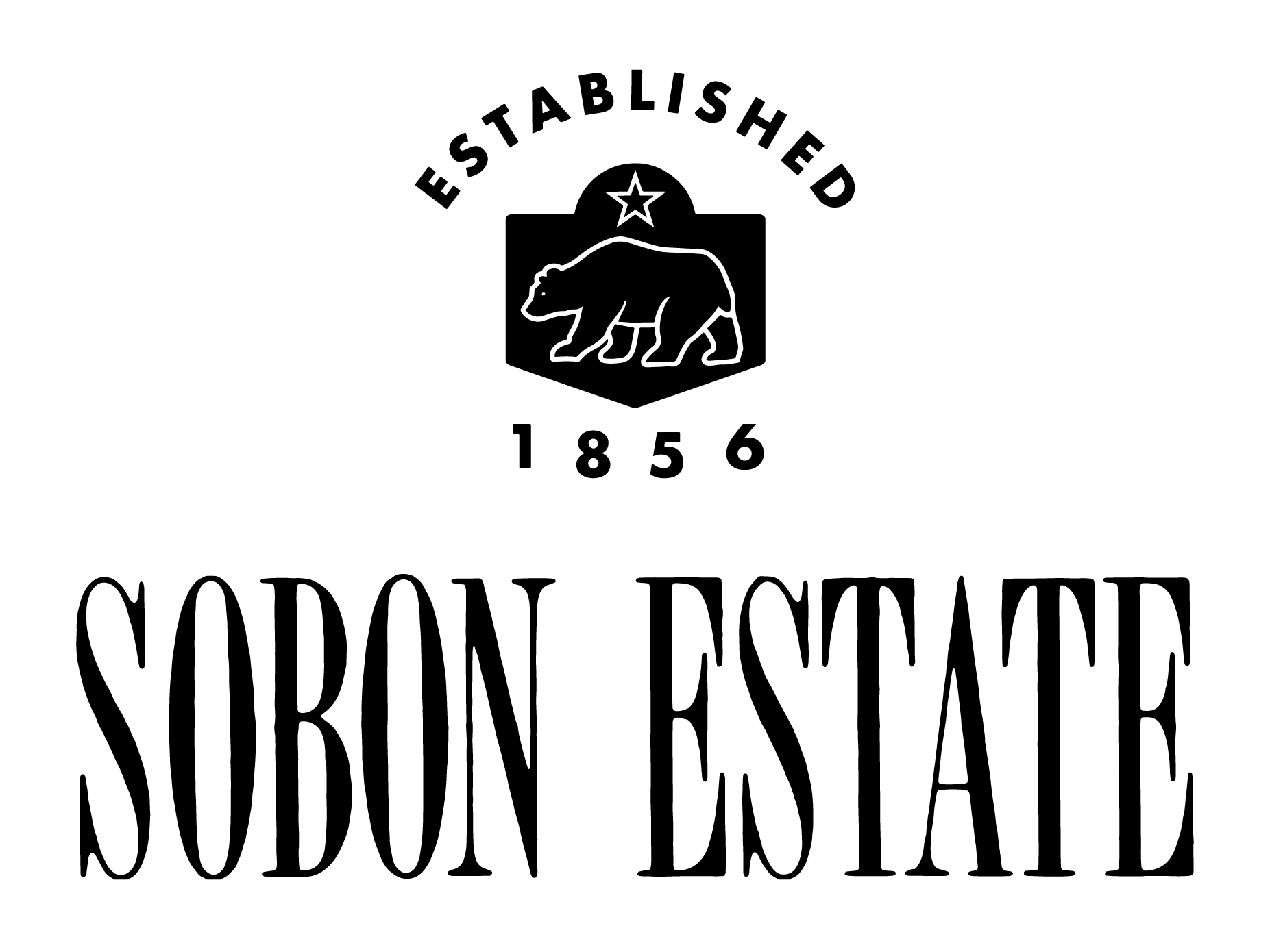
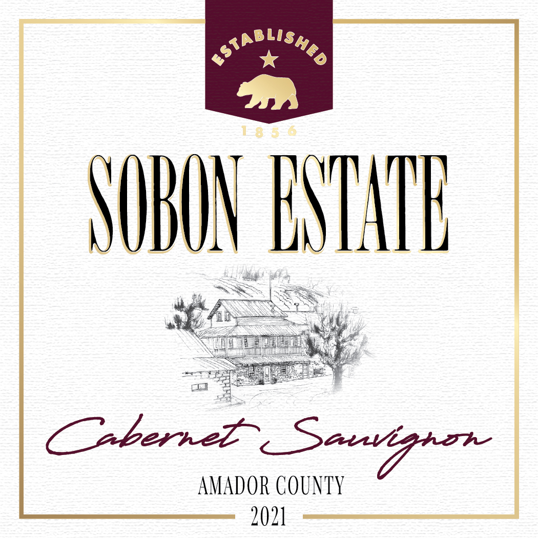
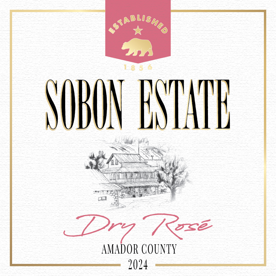
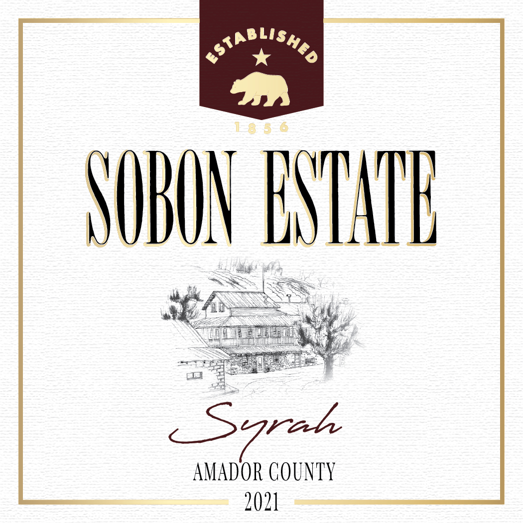
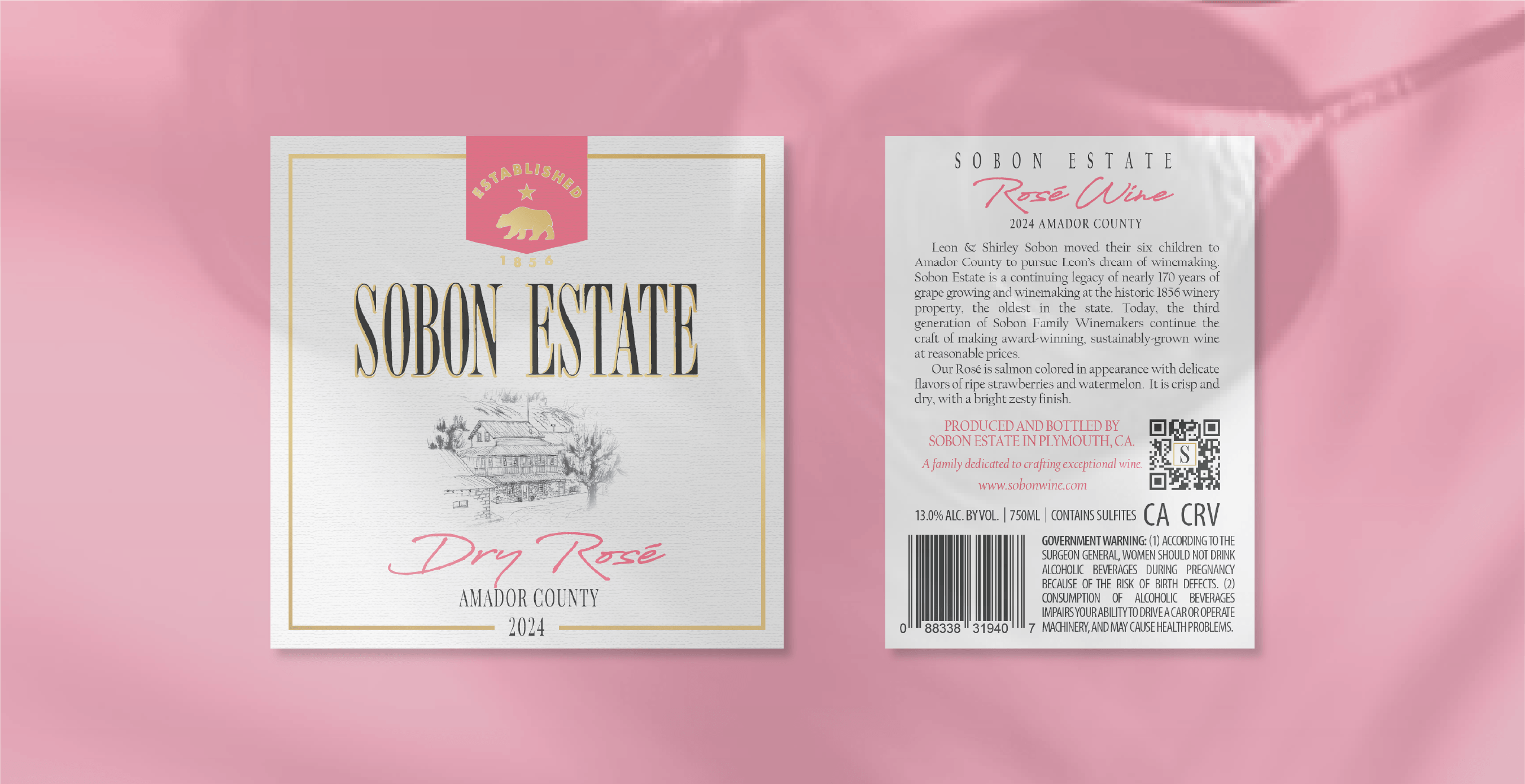
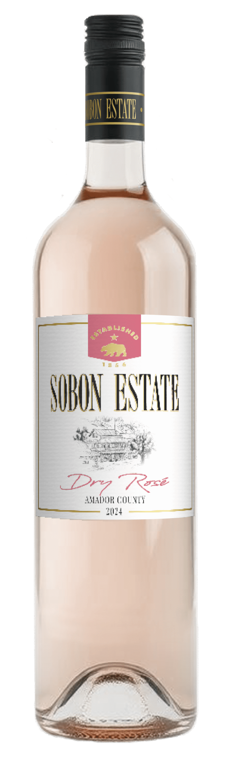
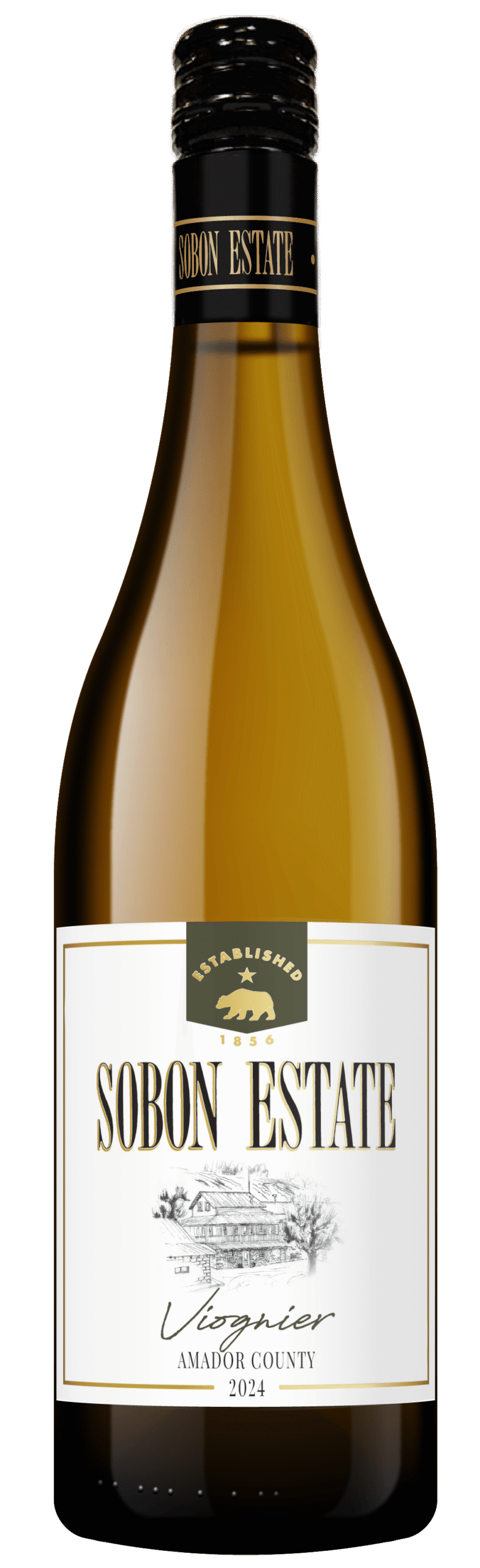
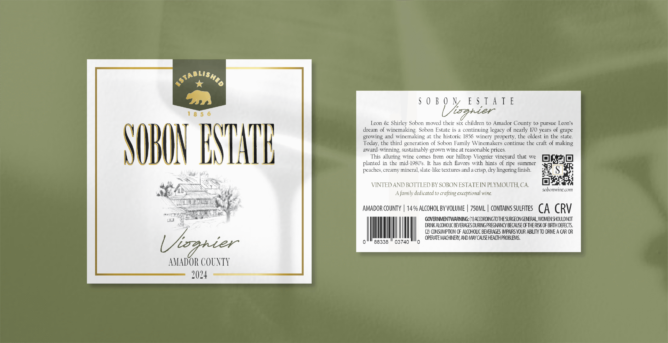
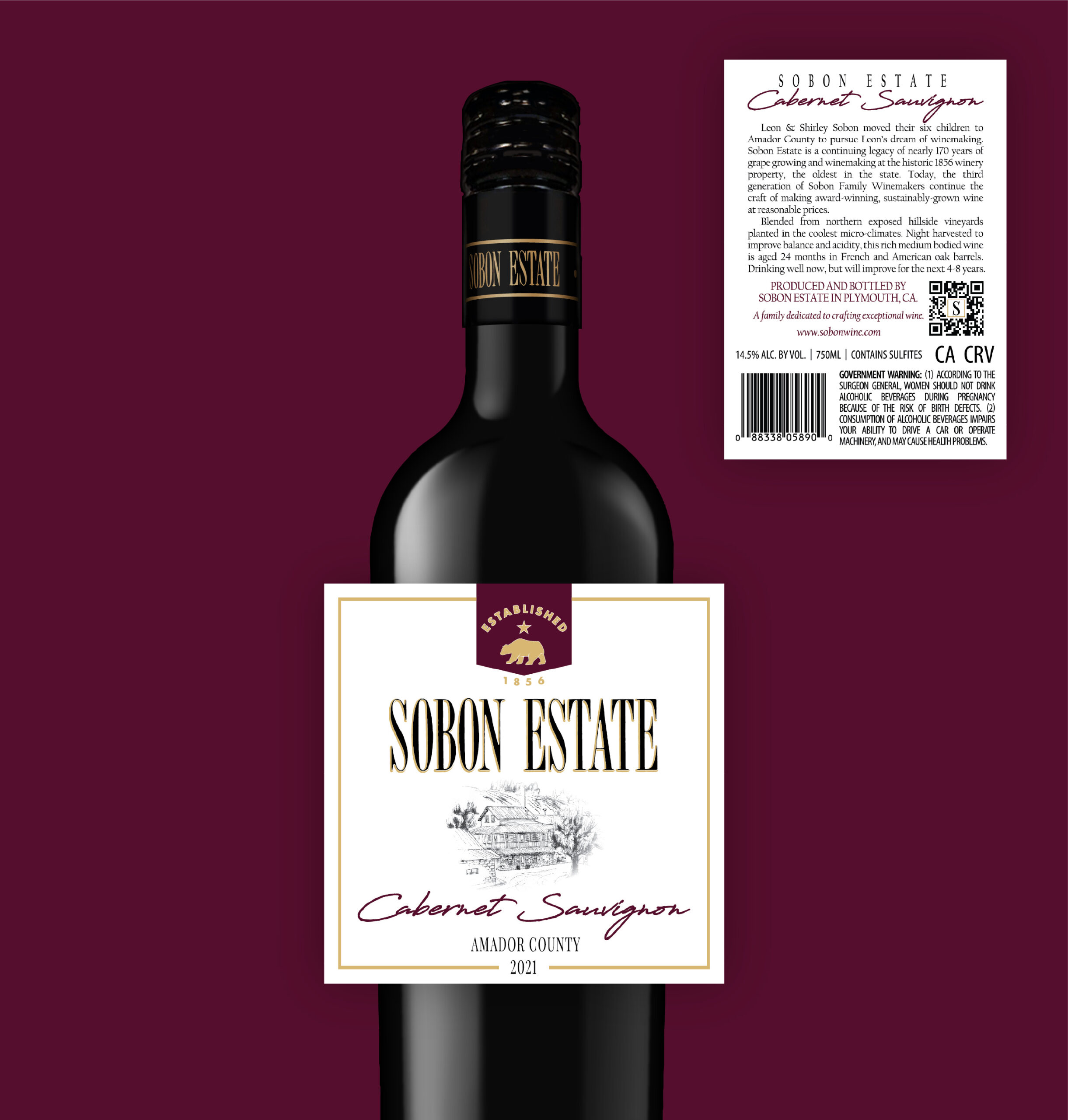
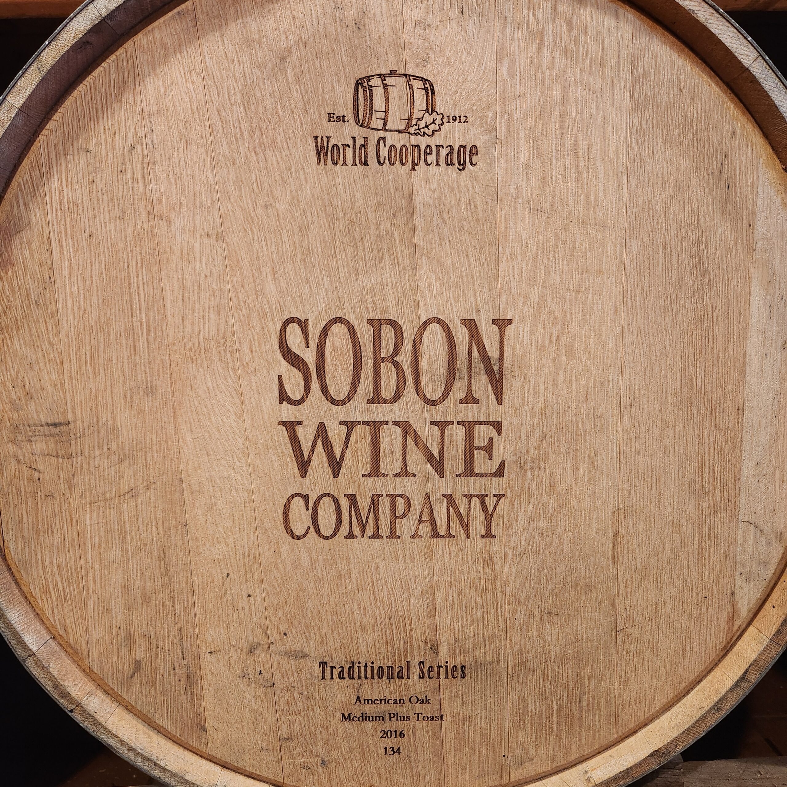
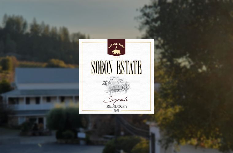
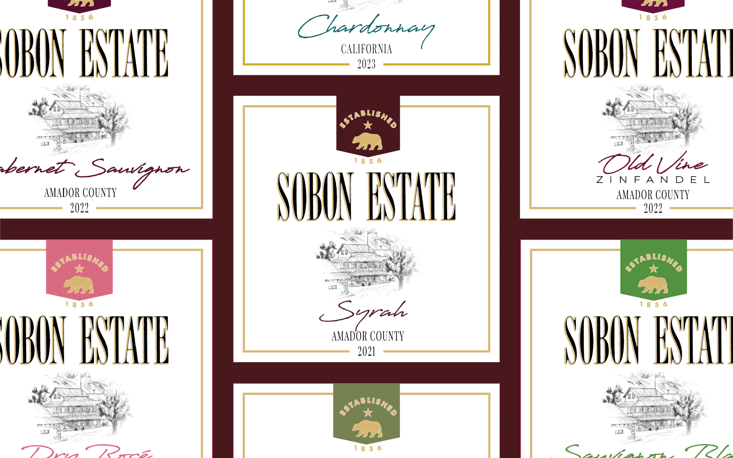
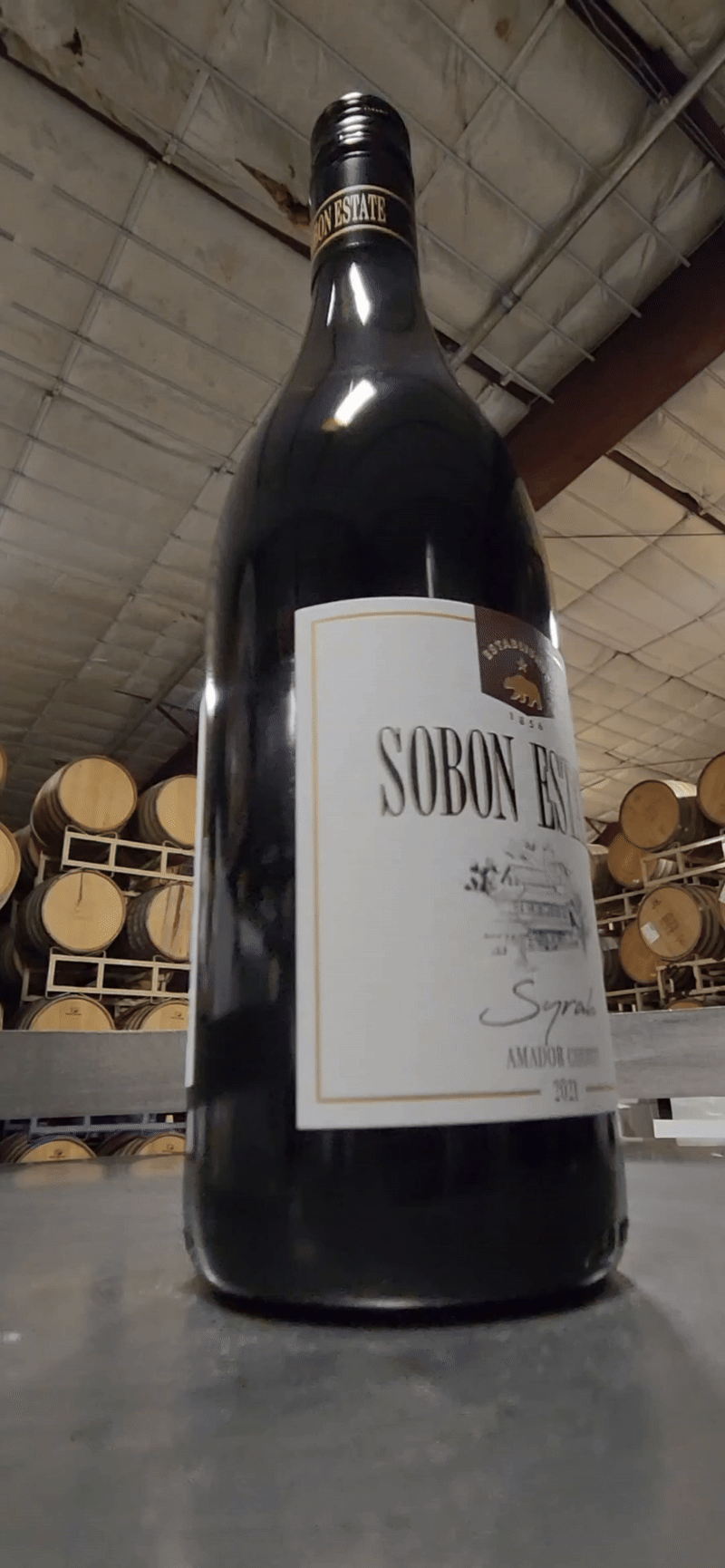
I knew there were several elements I wanted to include on the label. On some of the other labels the company used, there was a border that went around the edge of the label perimeter. Since we weren’t going to get a custom capsule top made for the new label, I thought that the line motif would help tie the label design to the capsule design they were anticipating using. Another element I wanted on the label was an illustration of the estate. This is an important aspect of the traditional estate look, and when we found an old pencil drawing of the historical farmhouse, I knew it would be perfect. It needed some editing, but the quality and content made it ideal for the front label

I always mock up a few different designs so that when I present my creations to management, they have options to choose from. Because the company is a family business, it was crucial that I received feedback from multiple family members, not just the managers. After a few rounds of feedback, the family agreed on a label they liked best, allowing me to move forward with refining the final design.

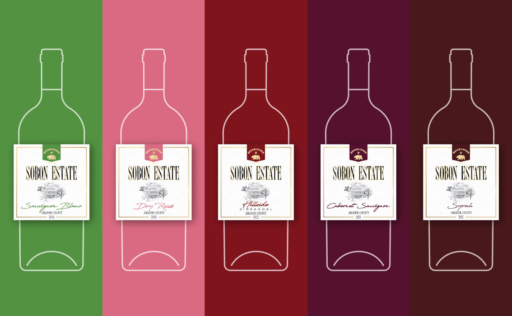
My solution for the different wine bottles was to create two versions of the same design. High-shoulder wine bottles would feature an elongated version of the design, while low-shoulder bottles would have a 1:1 version with a wider back label. However, this approach didn’t work because management didn’t want two different dye lines for the label. Instead, I used the 1:1 front label, which would fit both bottle types, while the back label would maintain the same size. For high-shoulder bottles, it would be in portrait layout, and for low-shoulder bottles, it would be in landscape layout.

Near the end of the design process, as final decisions were being made about the label, California released their CA CRV law, and we had to find space for the CA CRV on the back label. I was able to incorporate this into the design seamlessly.
iMPACT
Through this project, I significantly enhanced the storytelling aspect of the Sobon Wine brand. Prior to the new label, there was no mention of the family’s history or an image of the estate on the front label. I not only provided a visual representation of the historical estate that the winery is known for but also offered customers insight into the family that has been farming in Amador since 1977.

In addition to enriching the brand's narrative, I developed a cohesive brand identity for the labels that can be applied across other design projects, strengthening overall brand recognition. Many consumers do not associate Amador County with California wine, and this new label helped establish the region in their minds, making it more memorable when seen on shelves. By emphasizing the winery's rich history, I was able to highlight the Amador winemaking culture effectively.

Upon the wine's release, we received a wealth of positive customer feedback, both in the tasting rooms and via email, praising the new label design. This response affirmed the impact of the project and its contribution to the brand's identity and recognition.
Thanks for reading!
If you have any questions about my work or would like to collaborate, feel free to say hi!
erikanordman.designs@outlook.com
Designed & Developed By Me
Orange County, CA
© 2025 Erika Nordman
arrow-right