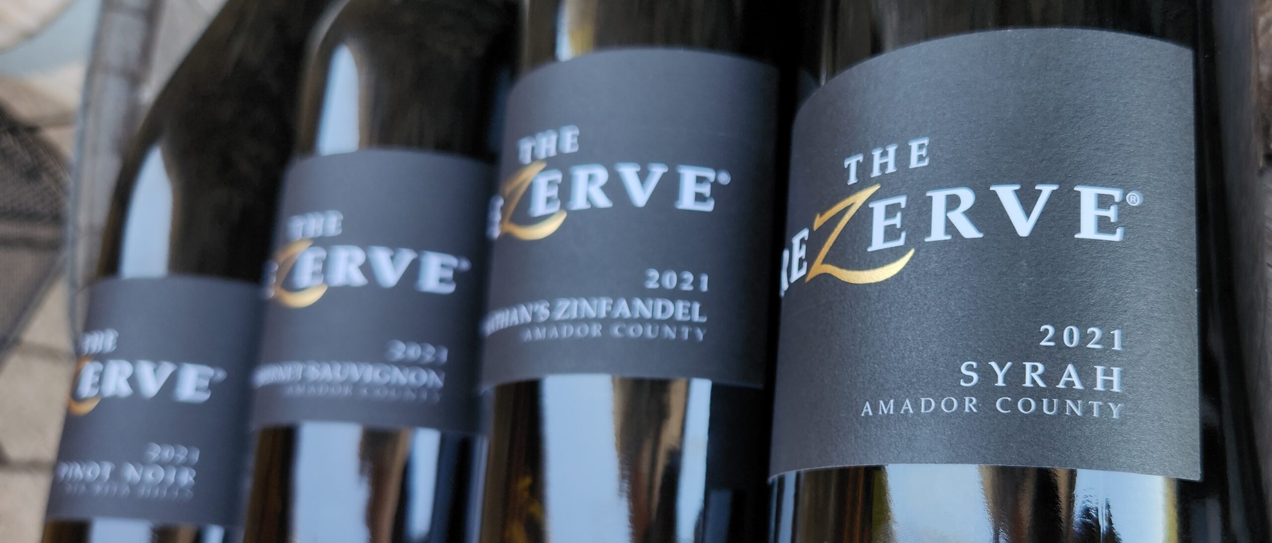
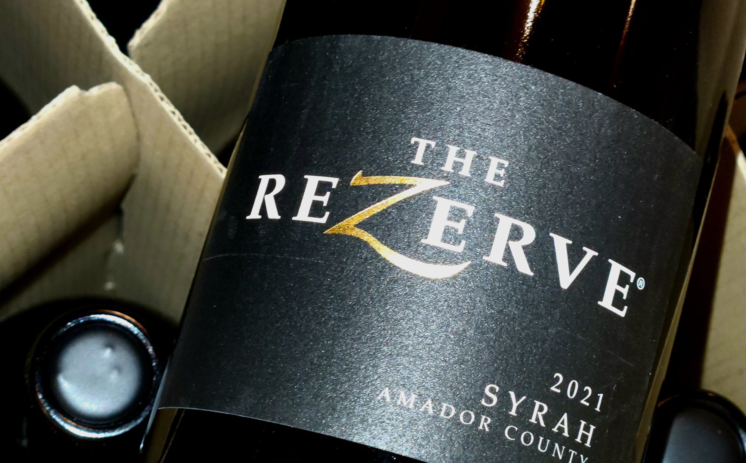
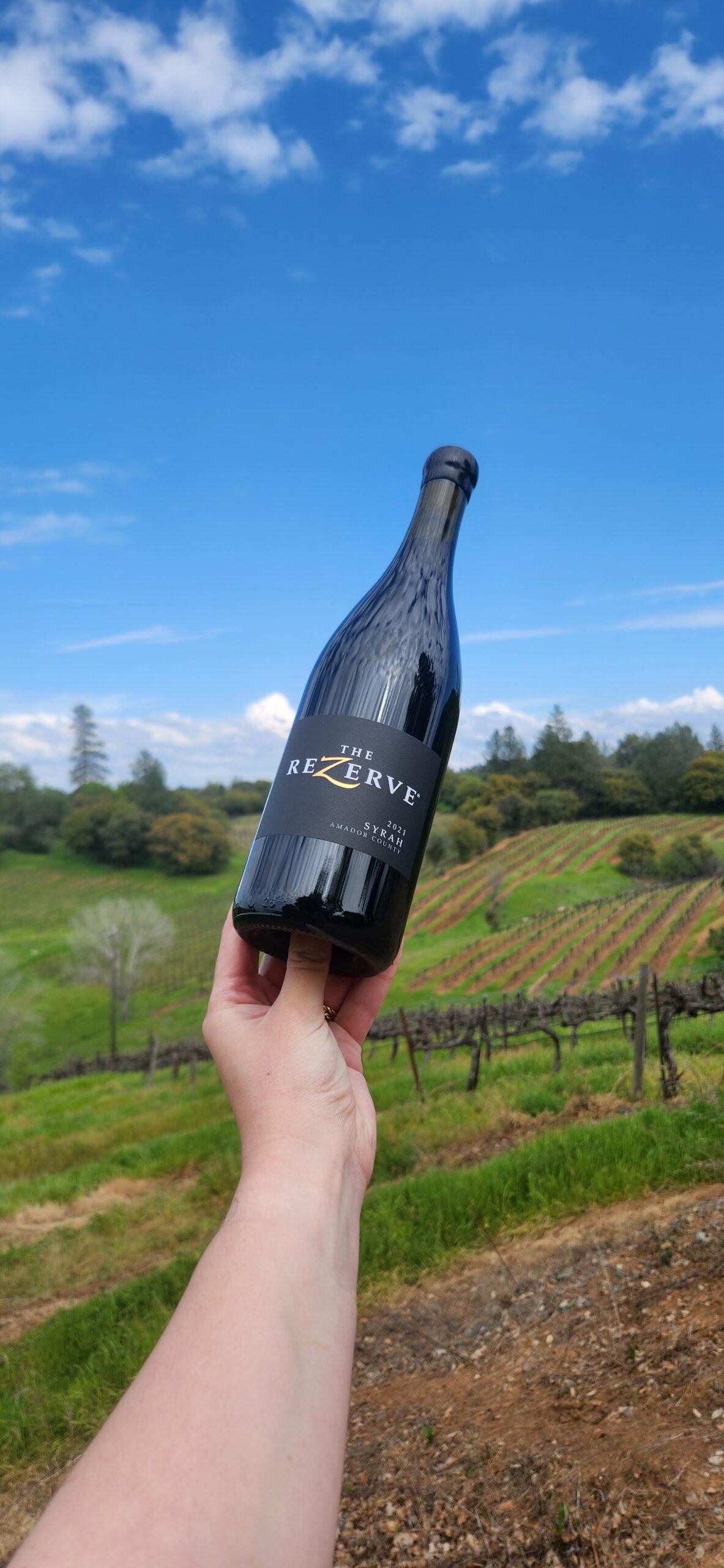
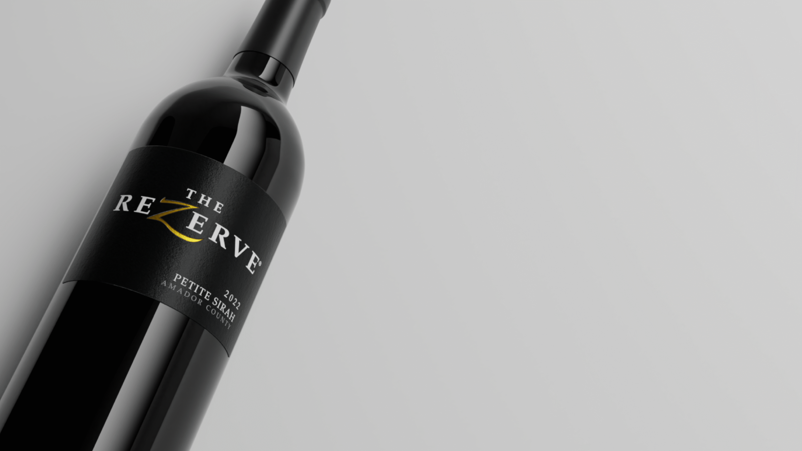
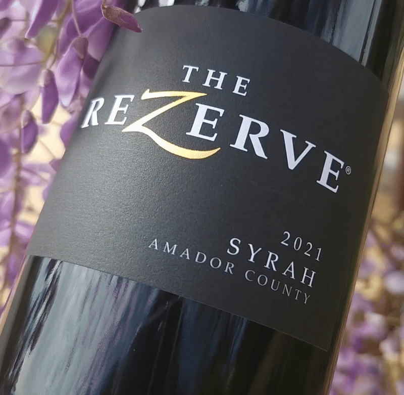
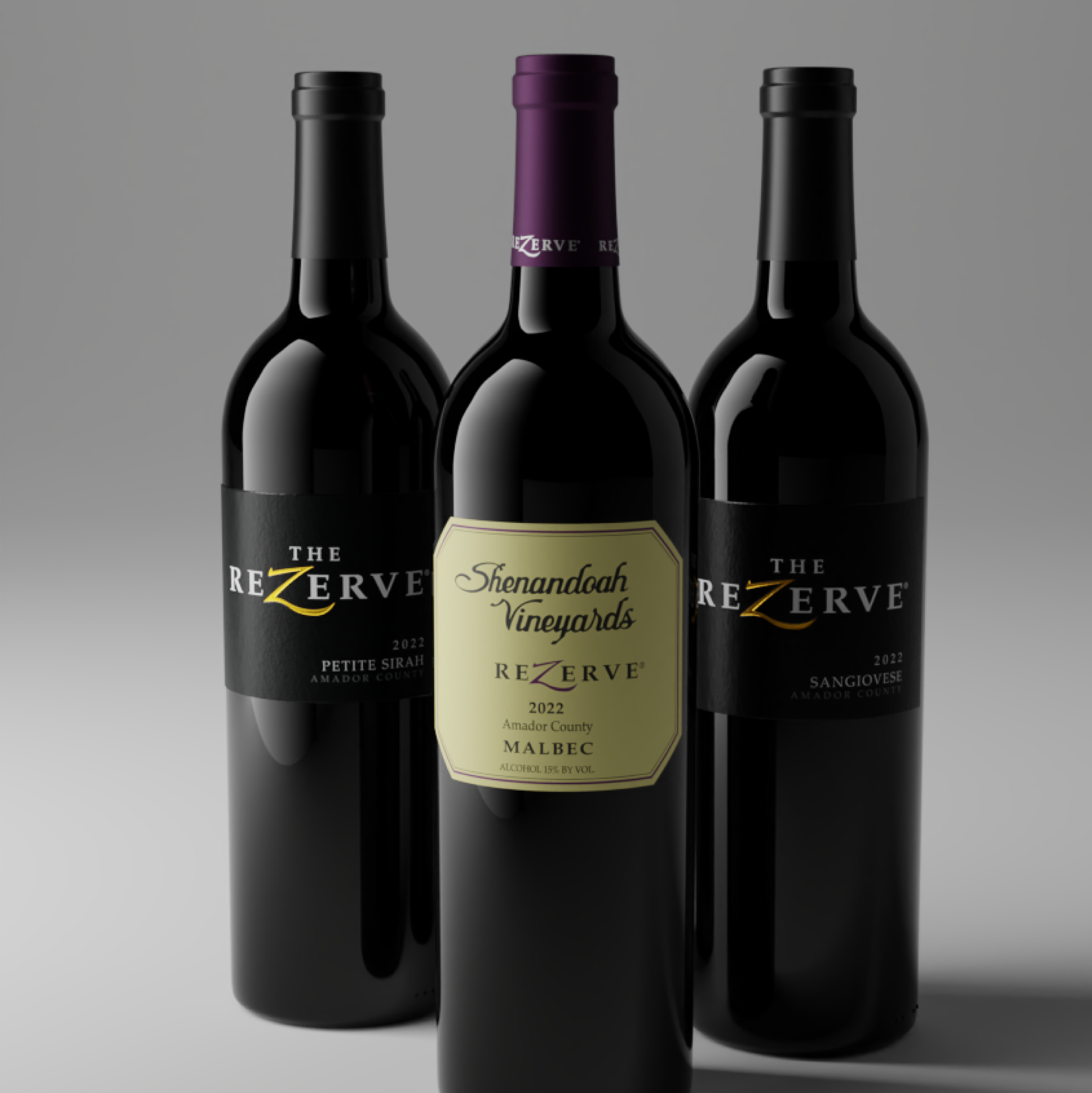
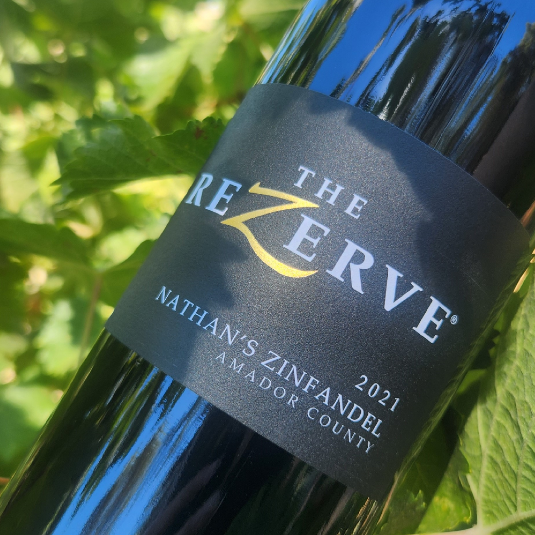
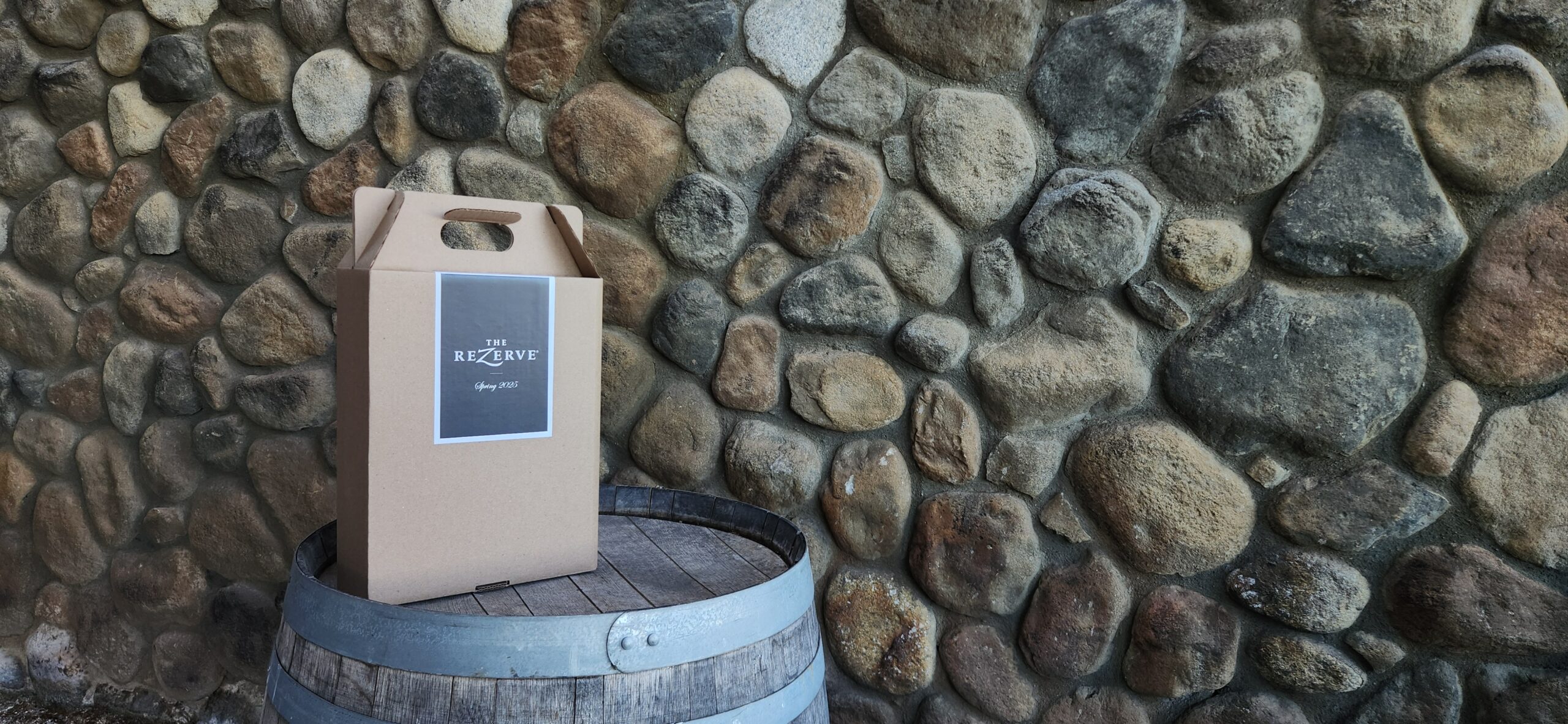
When digging through older labels that the company used in the 90's, I found a design of "The ReZerve®" logo that was foiled. The current ReZerve® labels didn't use any foil and I loved the look of the foiled "Z" which made my decicion for me to bring it back. Instead of the vintage yellow label background, I swiched it to a black label to give the club wines that elegant, premium look. The die-line I took from another one of the labels that they were already printing to save costs on cutting a new die-line and chose this style since it is flattering on both the taller and shorter bordeaux bottles. I also chose this label size becuase of the popular style of smaller labels on more specialty bottles.