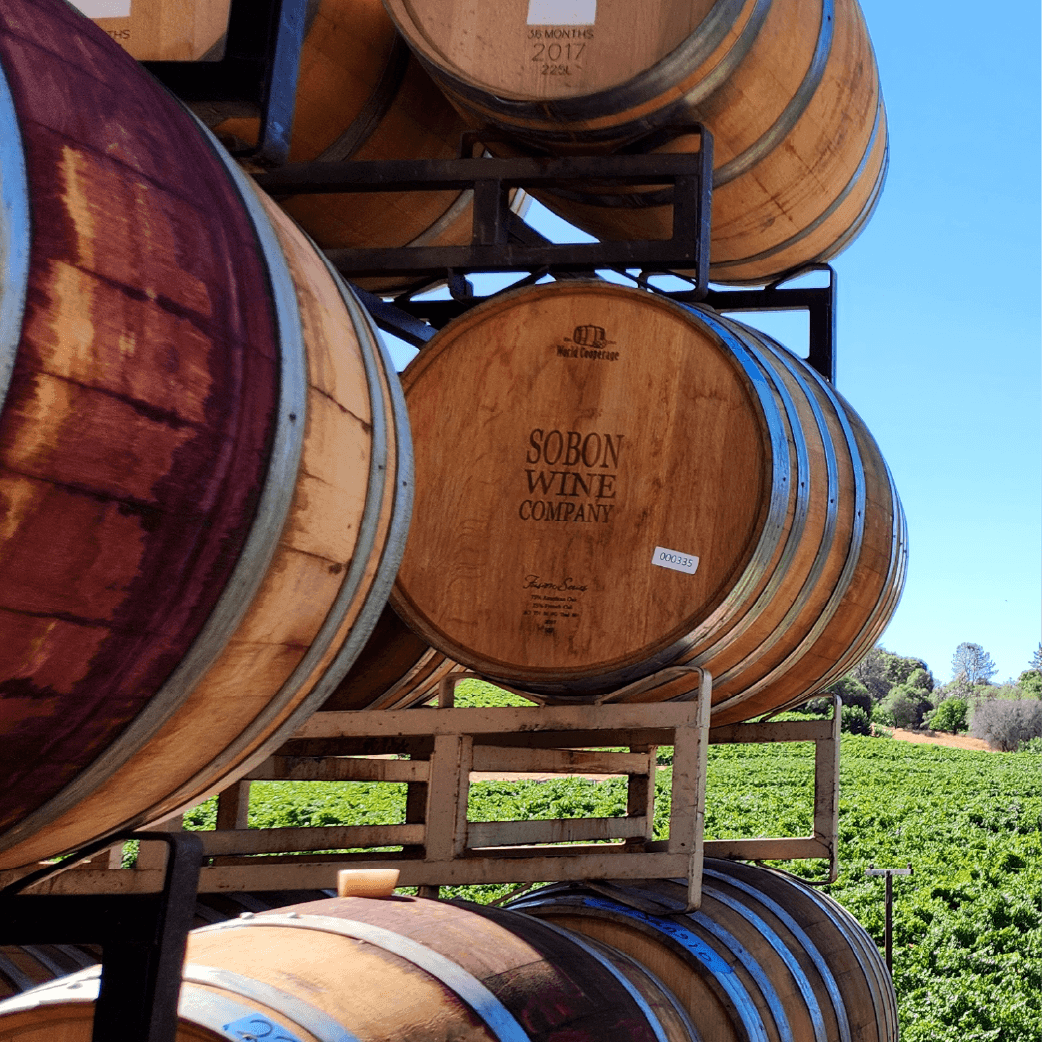
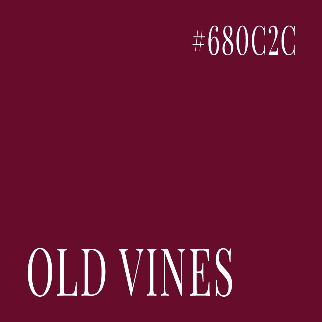
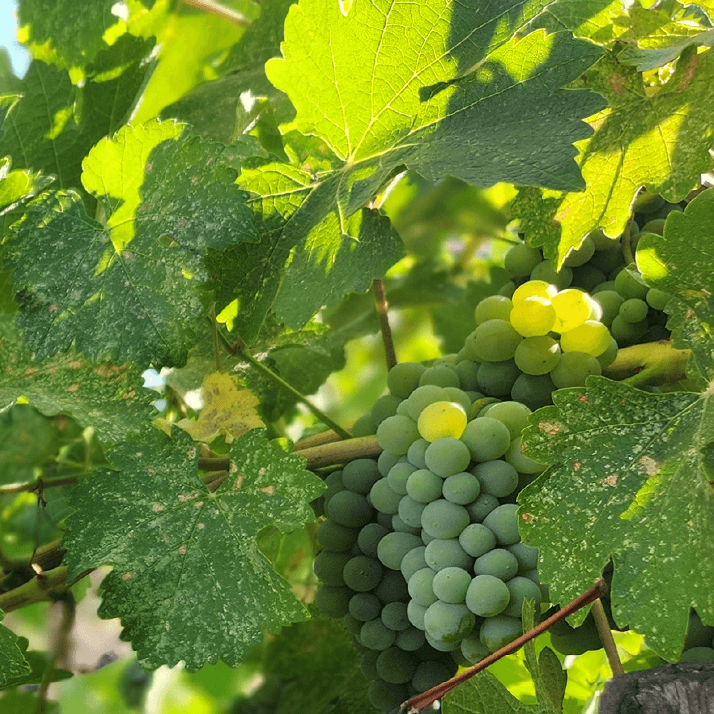
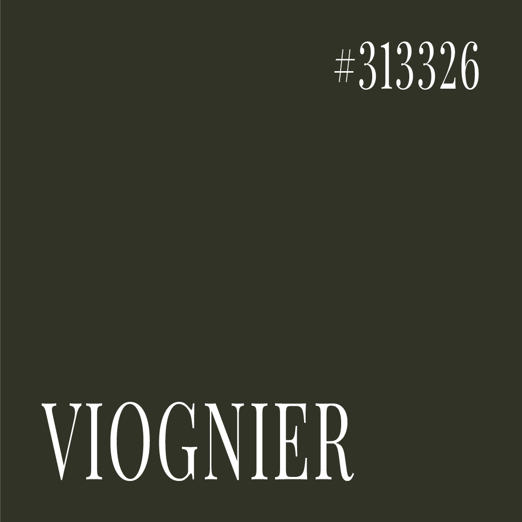
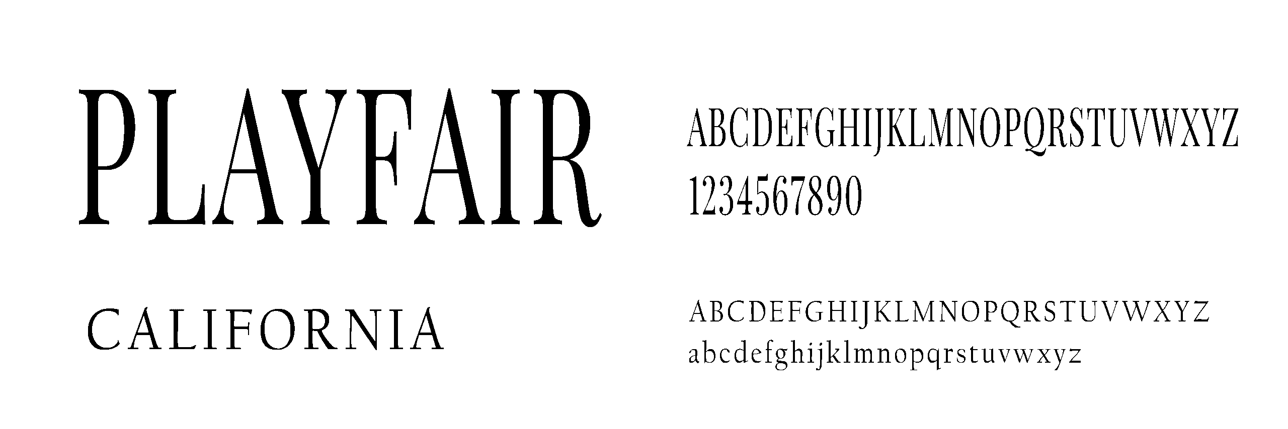
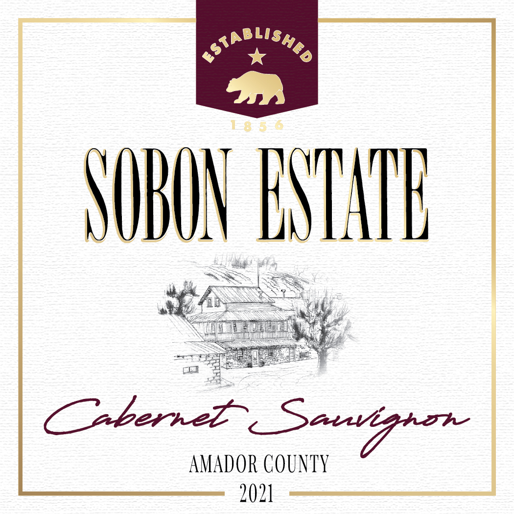
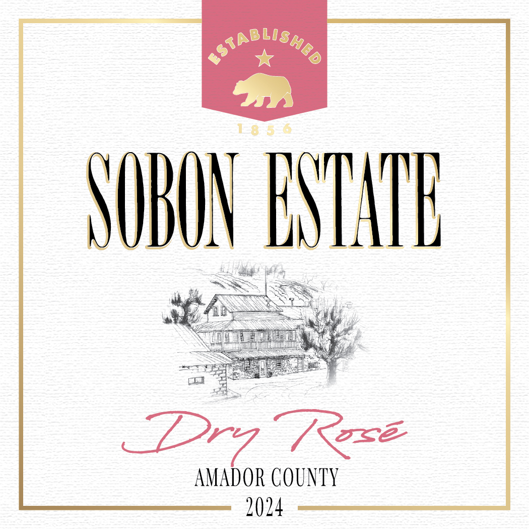
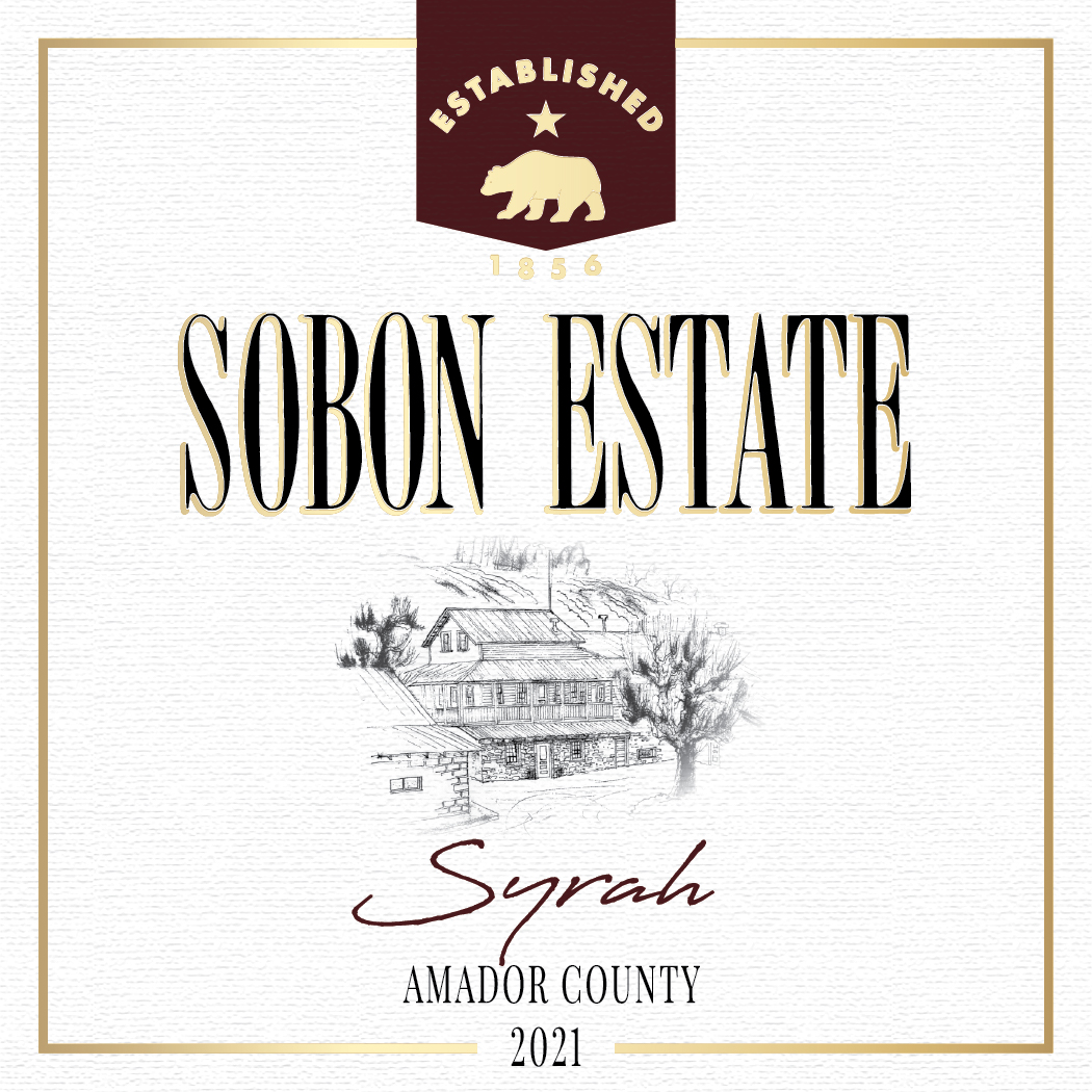
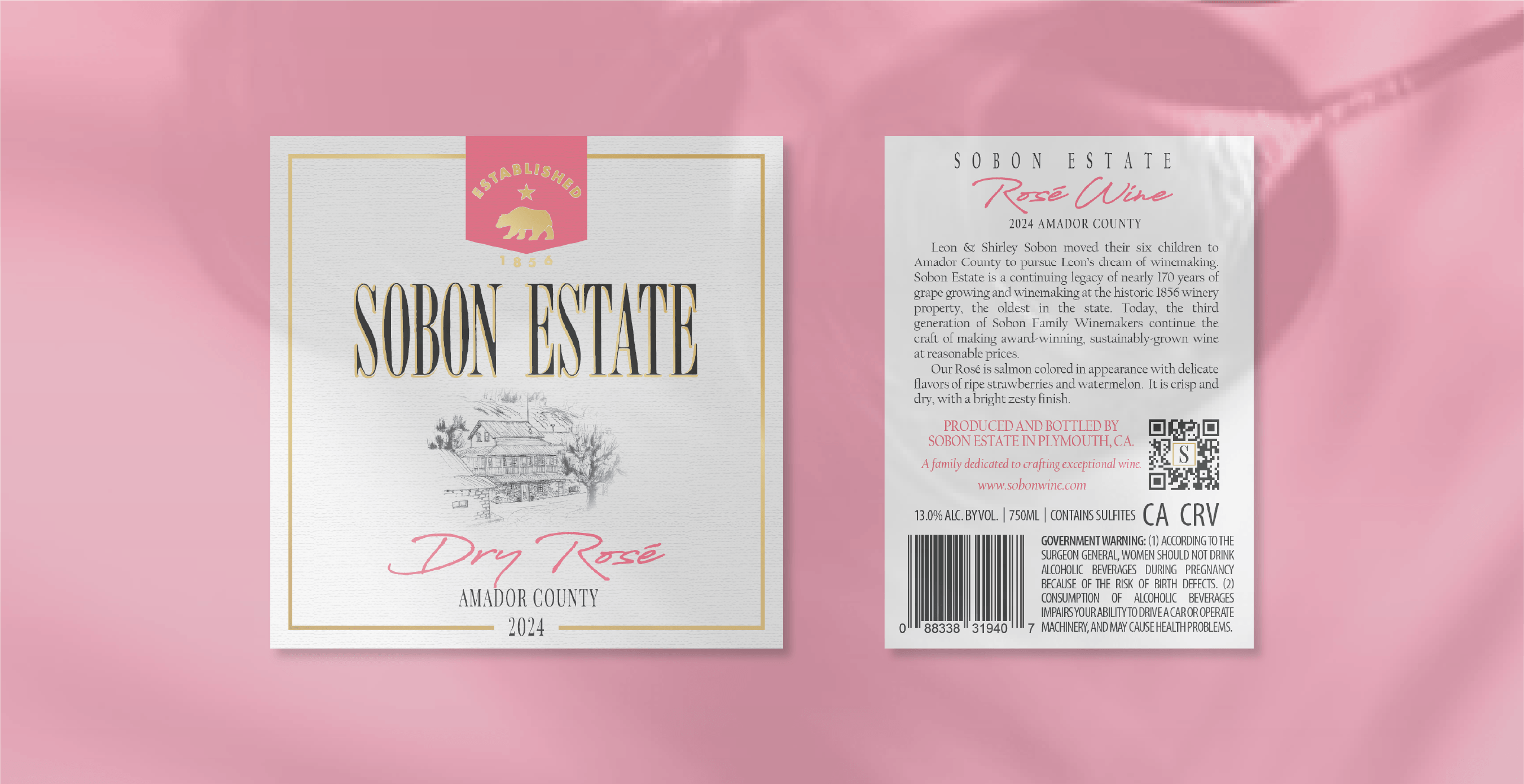
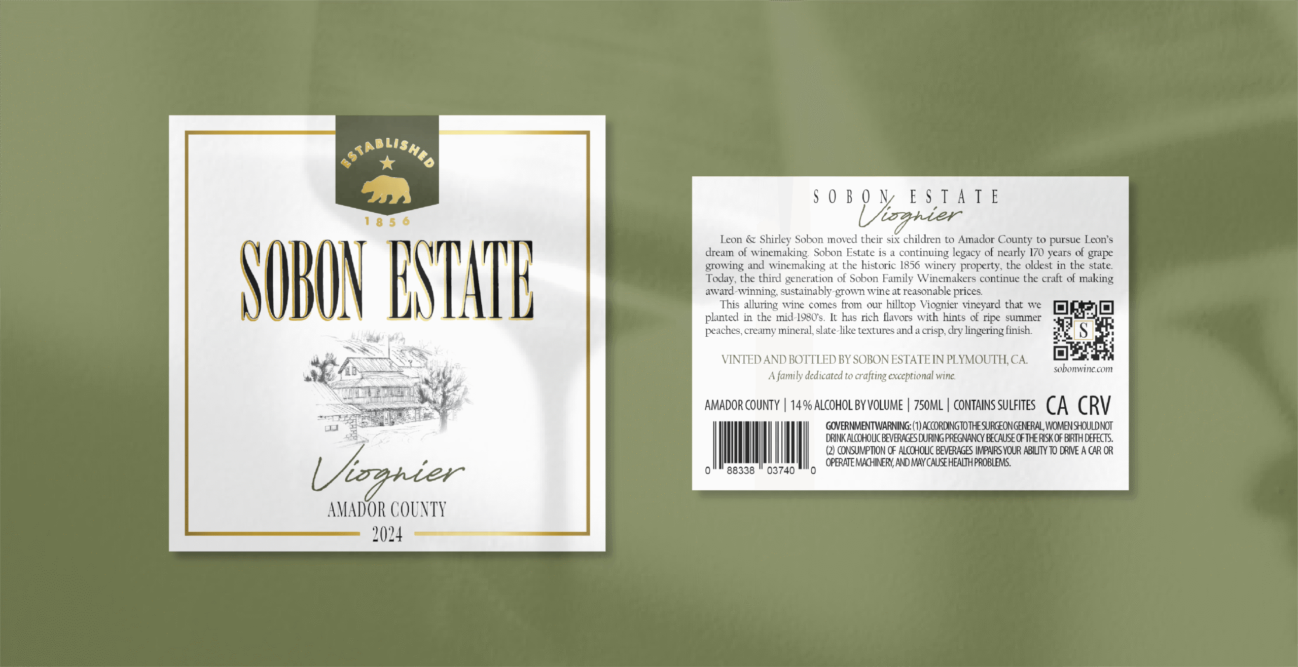
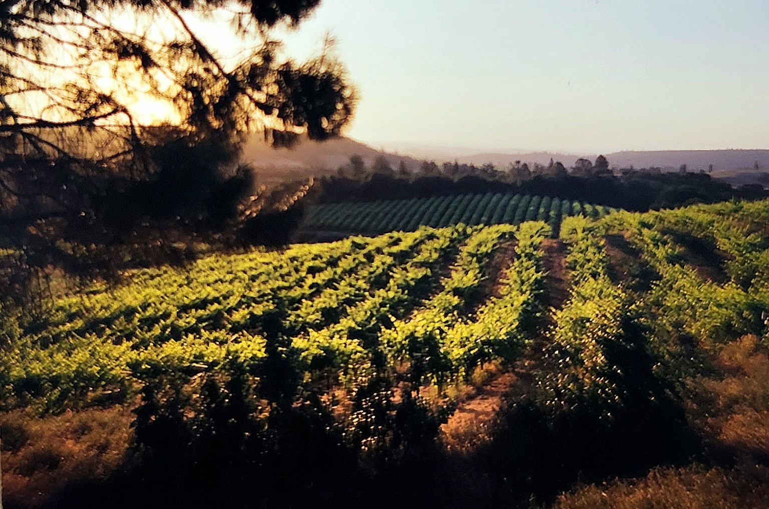
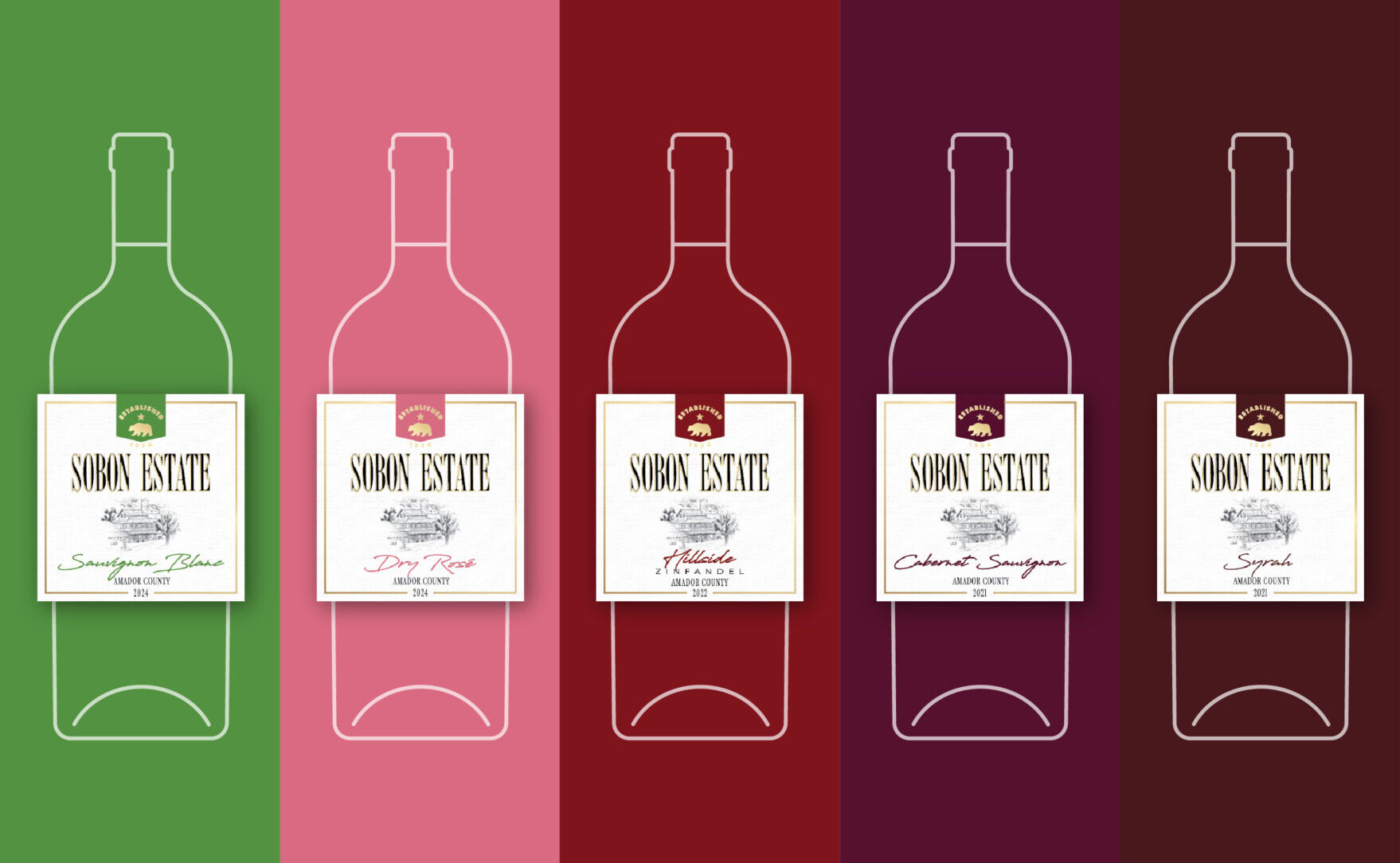
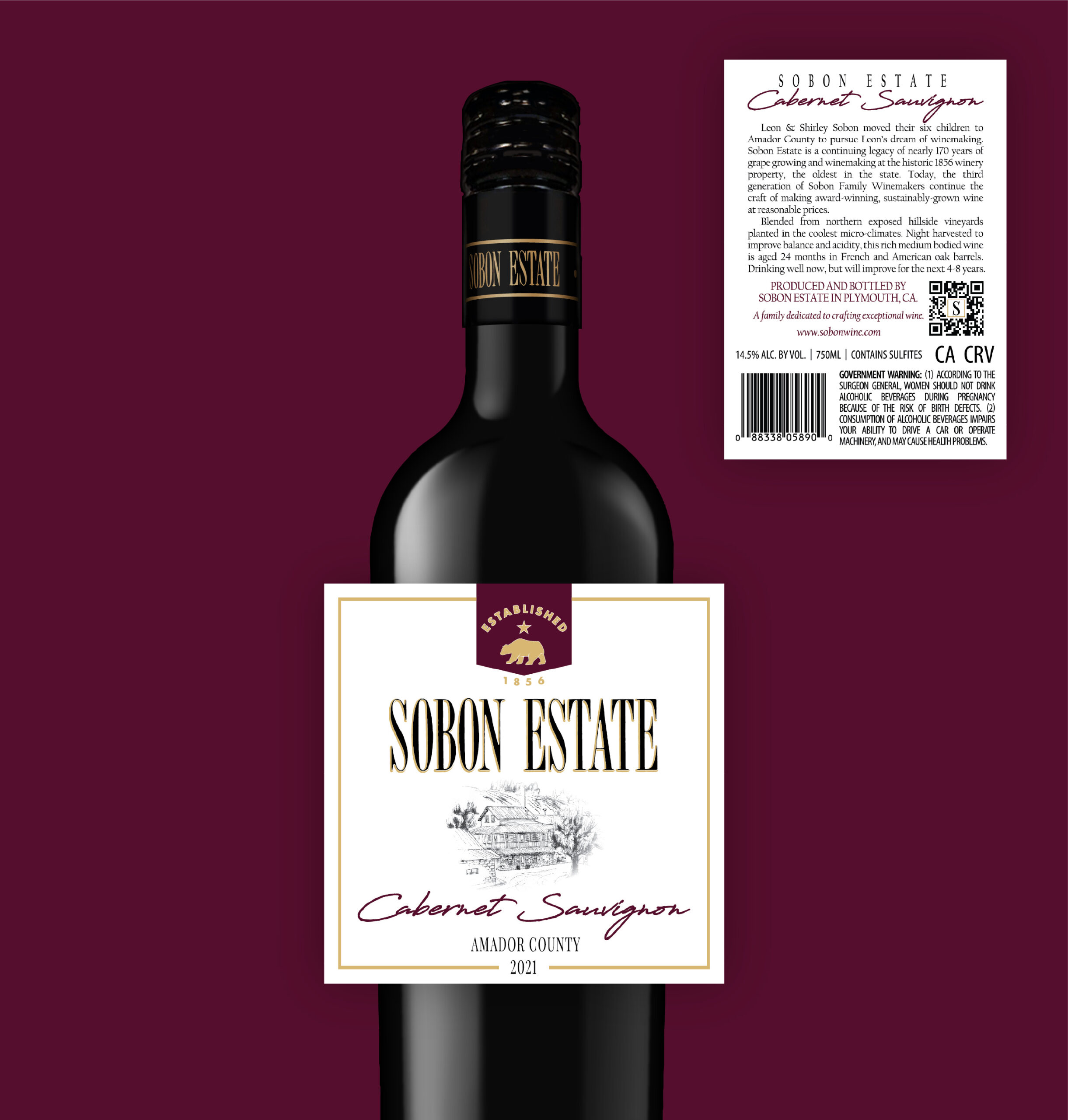
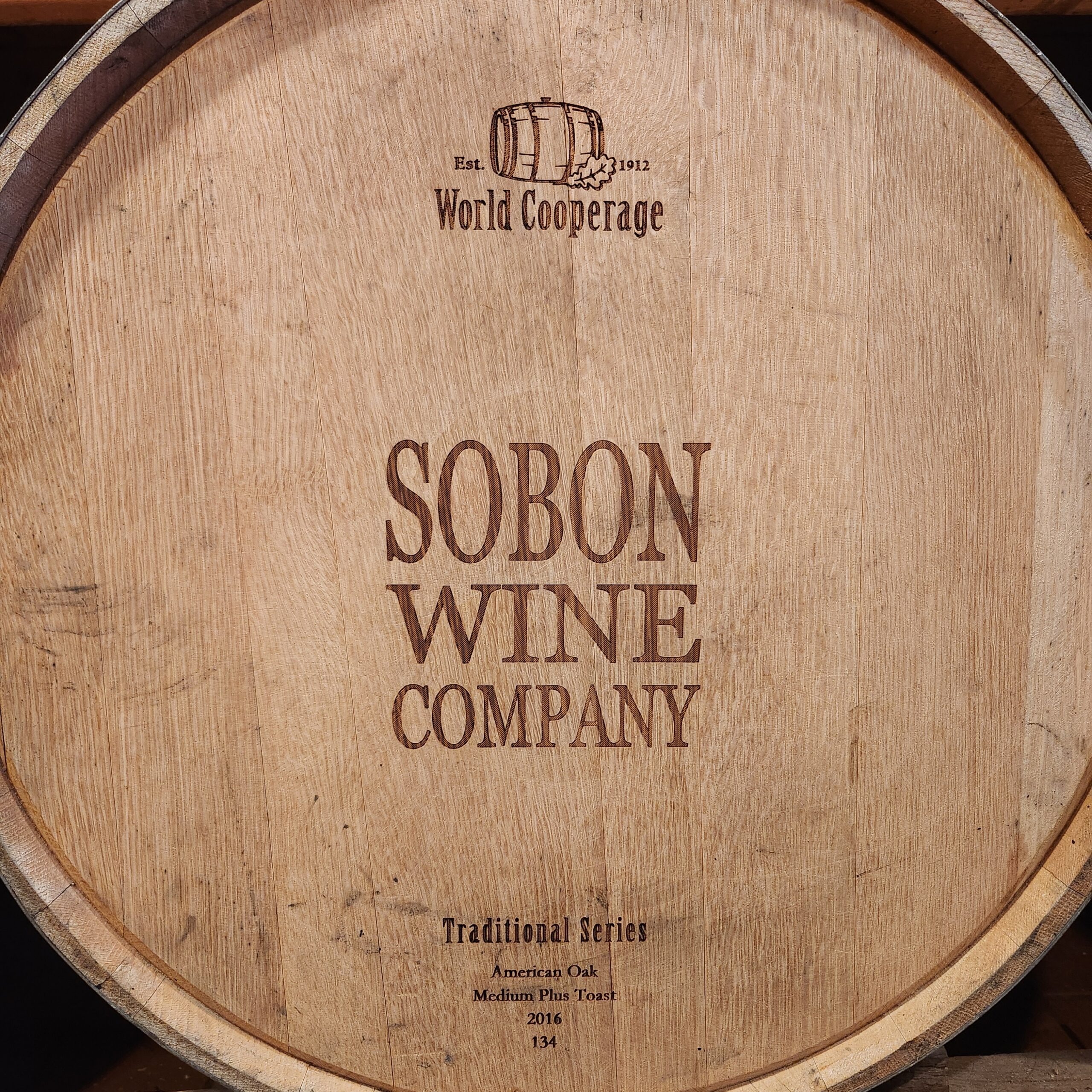
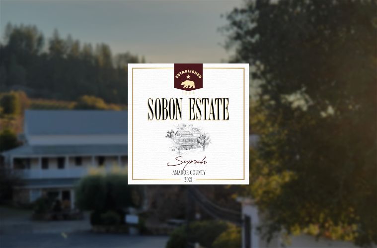
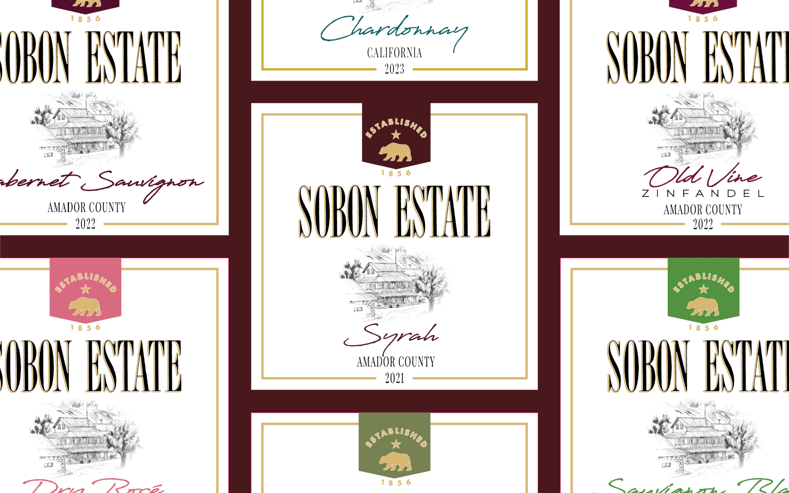
When it came time to start putting the design together, I had a wealth of photos, notes, and inspiration from my research that I began weaving together. I noticed trends right away in the styles, fonts, and colors used in the labels I had collected, and I began to piece together the brand identity that would serve as the foundation for my designs.
I knew there were several elements I wanted to include on the label. On some of the other labels the company used, there was a border that went around the edge of the label perimeter. Since we weren’t going to get a custom capsule top made for the new label, I thought that the line motif would help tie the label design to the capsule design they were anticipating using. Another element I wanted on the label was an illustration of the estate. This is an important aspect of the traditional estate look, and when we found an old pencil drawing of the historical farmhouse, I knew it would be perfect. It needed some editing, but the quality and content made it ideal for the front label
I always mock up a few different designs so that when I present my creations to management, they have options to choose from. Because the company is a family business, it was crucial that I received feedback from multiple family members, not just the managers. After a few rounds of feedback, the family agreed on a label they liked best, allowing me to move forward with refining the final design.
My solution for the different wine bottles was to create two versions of the same design. High-shoulder wine bottles would feature an elongated version of the design, while low-shoulder bottles would have a 1:1 version with a wider back label. However, this approach didn’t work because management didn’t want two different dye lines for the label. Instead, I used the 1:1 front label, which would fit both bottle types, while the back label would maintain the same size. For high-shoulder bottles, it would be in portrait layout, and for low-shoulder bottles, it would be in landscape layout.
Near the end of the design process, as final decisions were being made about the label, California released their CA CRV law, and we had to find space for the CA CRV on the back label. I was able to incorporate this into the design seamlessly.

