Graphic Design
Visual Identity
Design System
Brand Consistency

Visual Identity On Instagram

1. The Project

Sobon Wine Company is a family owned and operated winery in the Sierra Foothills of California that has been making wine since 1977. With customers across the US, they used instagram and facebook to keep customers in the know about the happenings in their tasting rooms but needed a more fleshed out visual identity to give their established logos and posts a more consistent frame work. I offered to help create a more consistent brand across their Meta Business Portfolio and establish a visual identity around their logos to help create a recognizable brand for their social media campaigns.

2. The Goals

Make a visual identity for Instagram and Facebook using the two logos and established colors used on their wine bottles.
Create a template that could be used to create posts in order to speed up the design process.

3. My Role

Graphic Designer
Social Media Researcher

Research

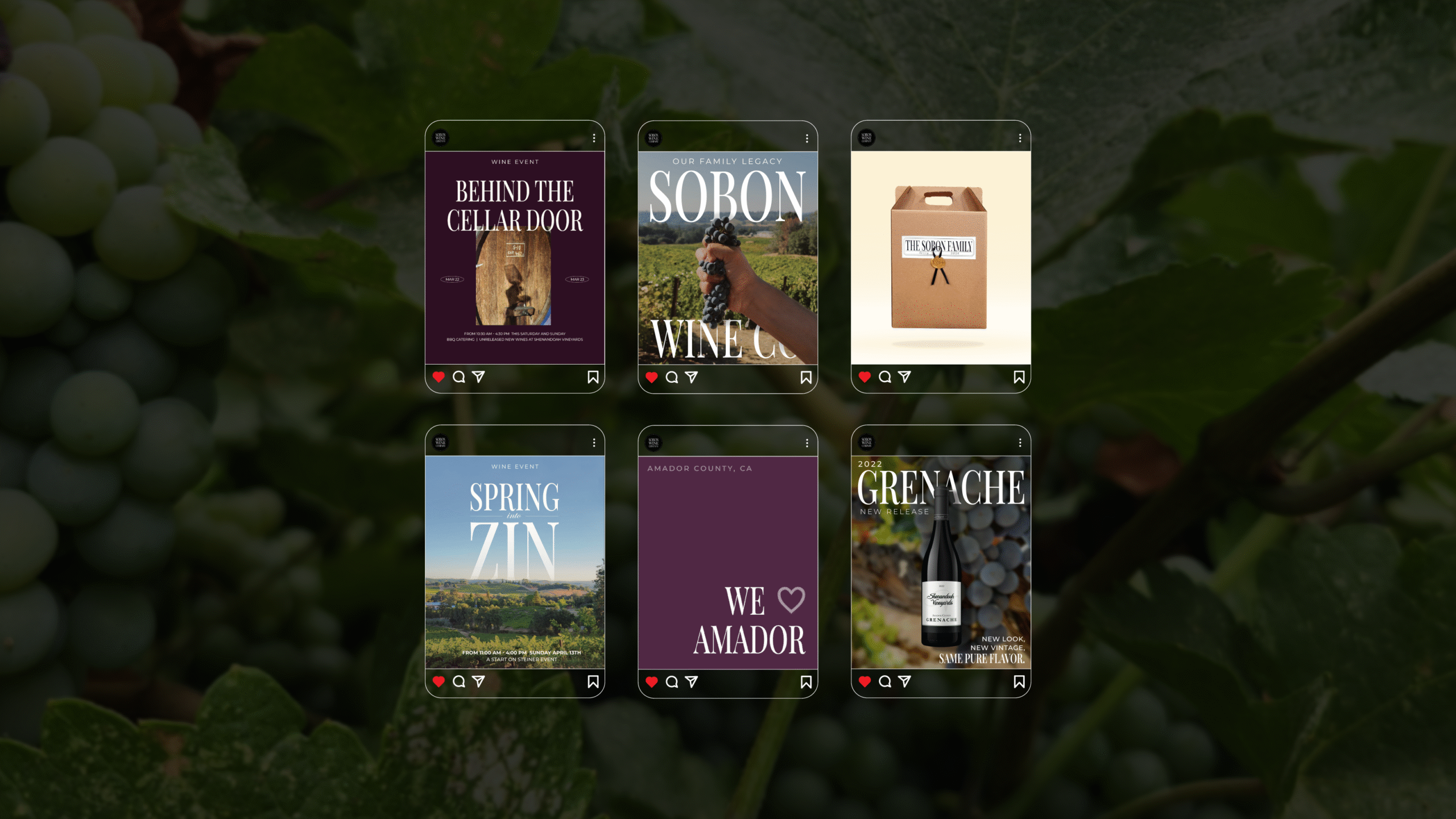
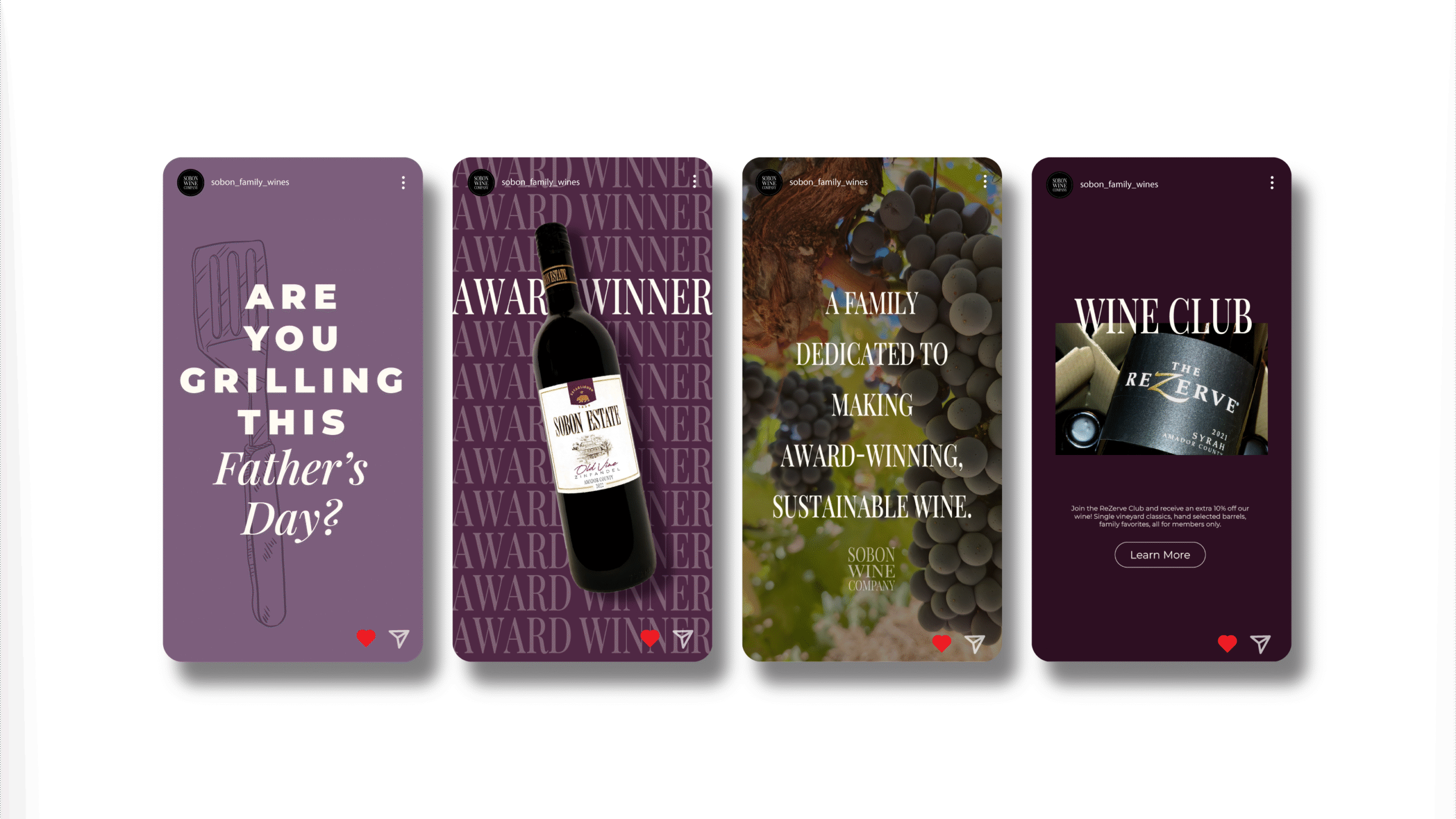
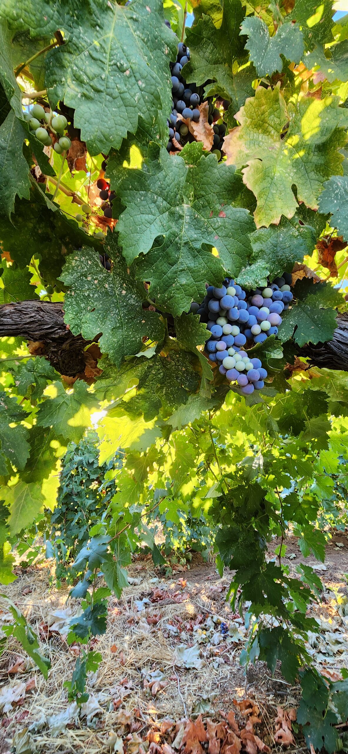
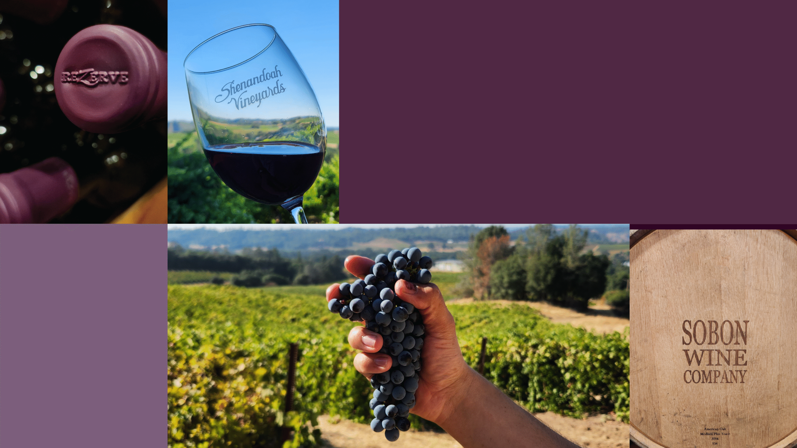
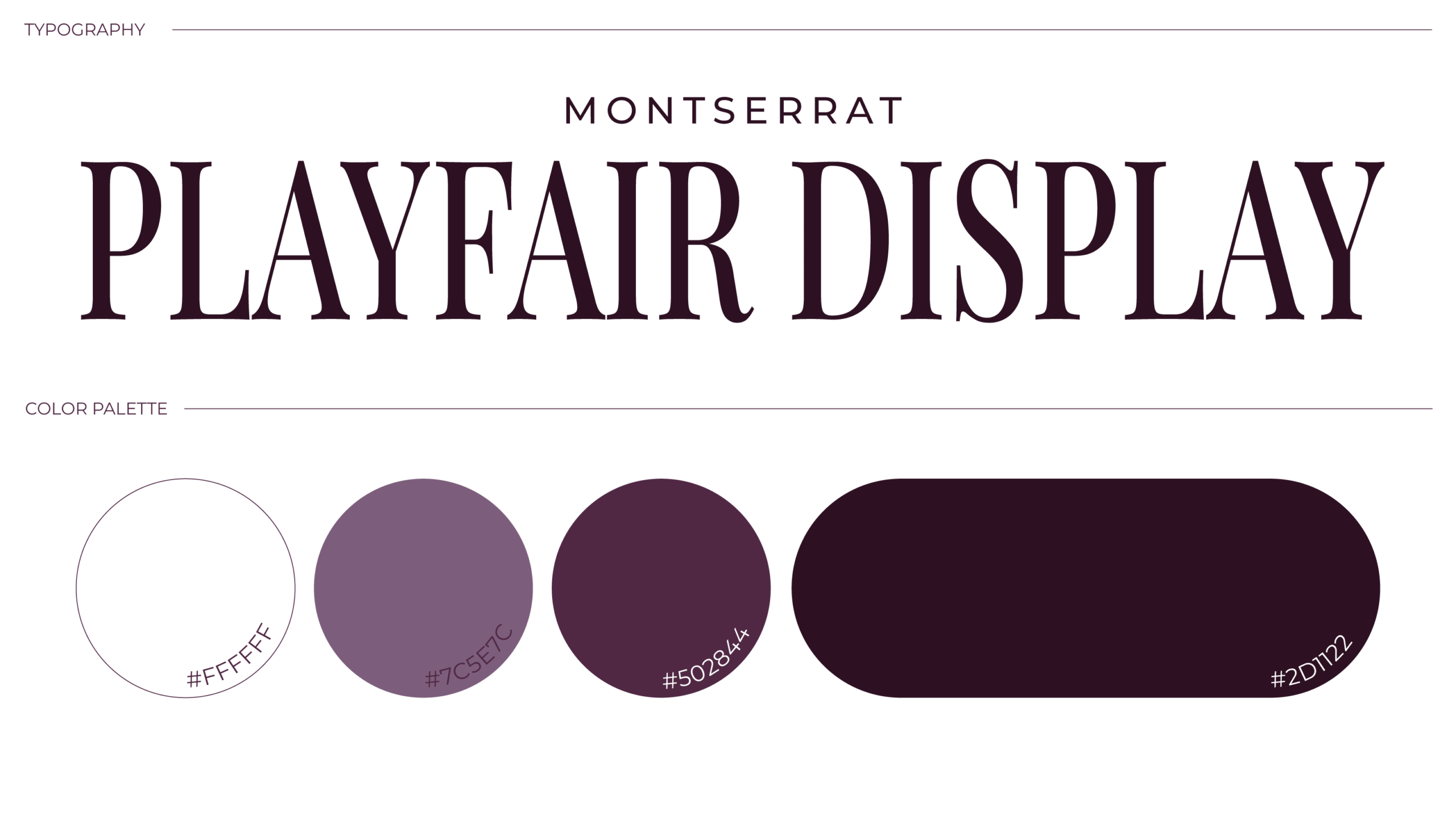
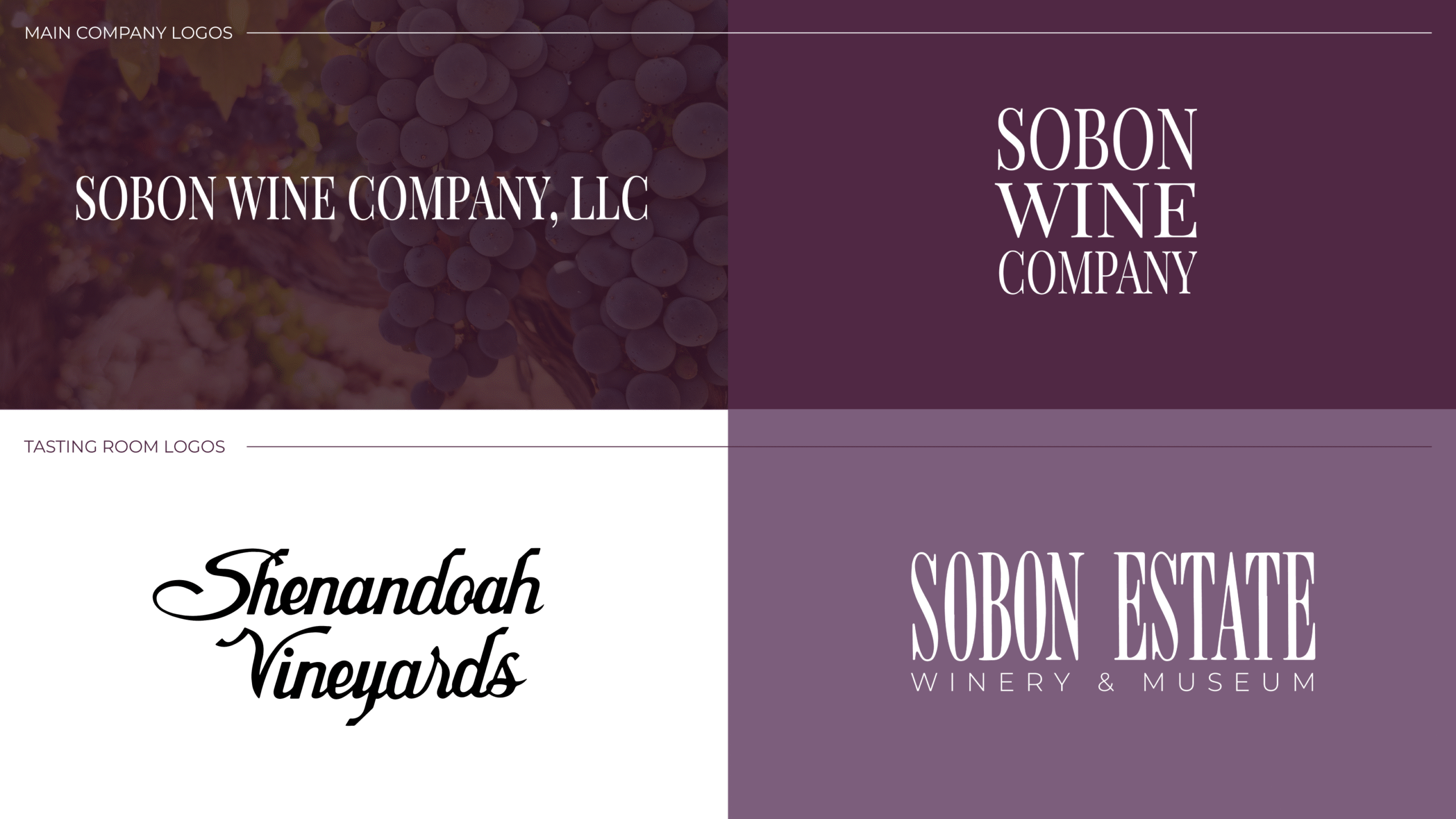
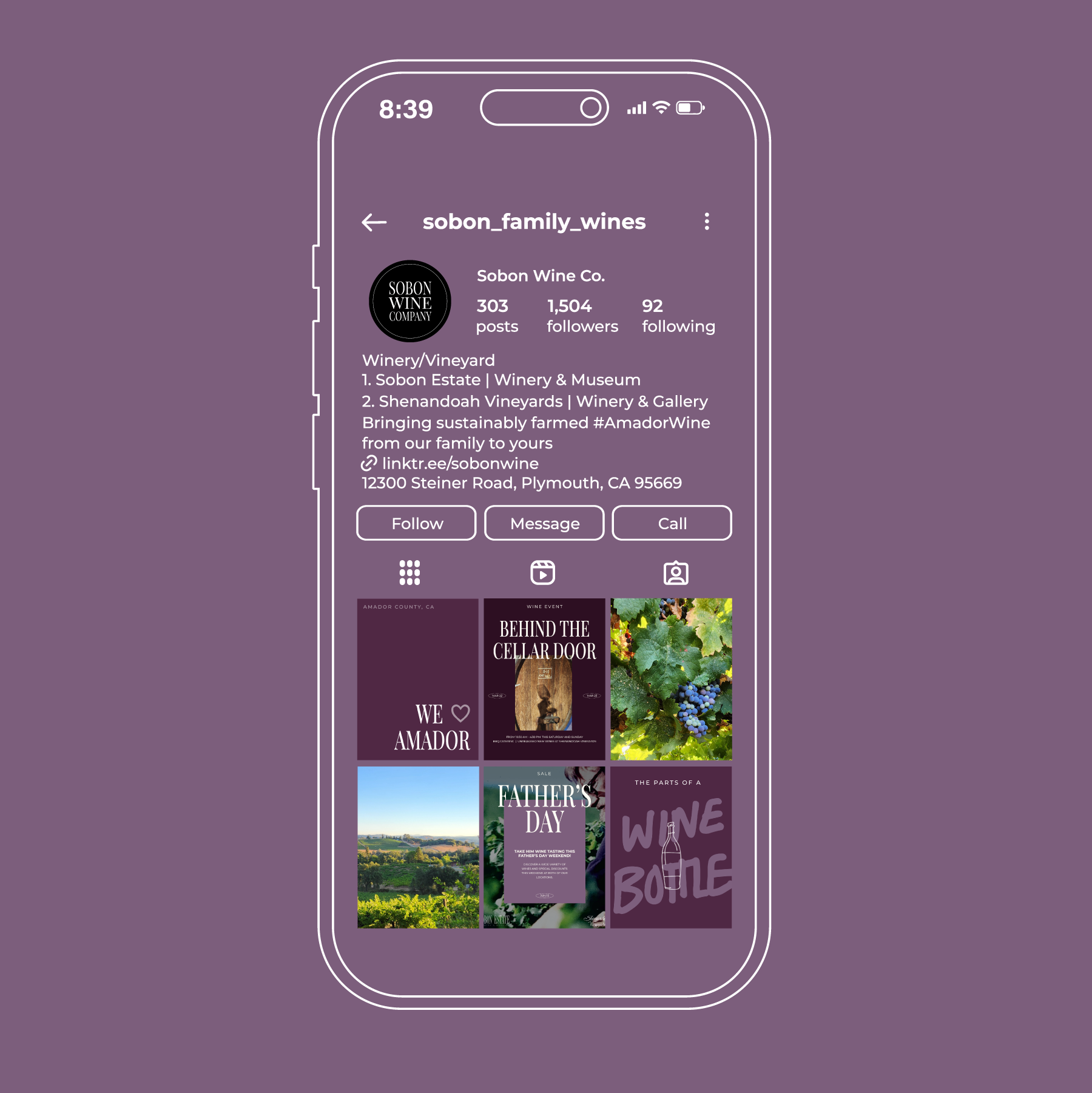
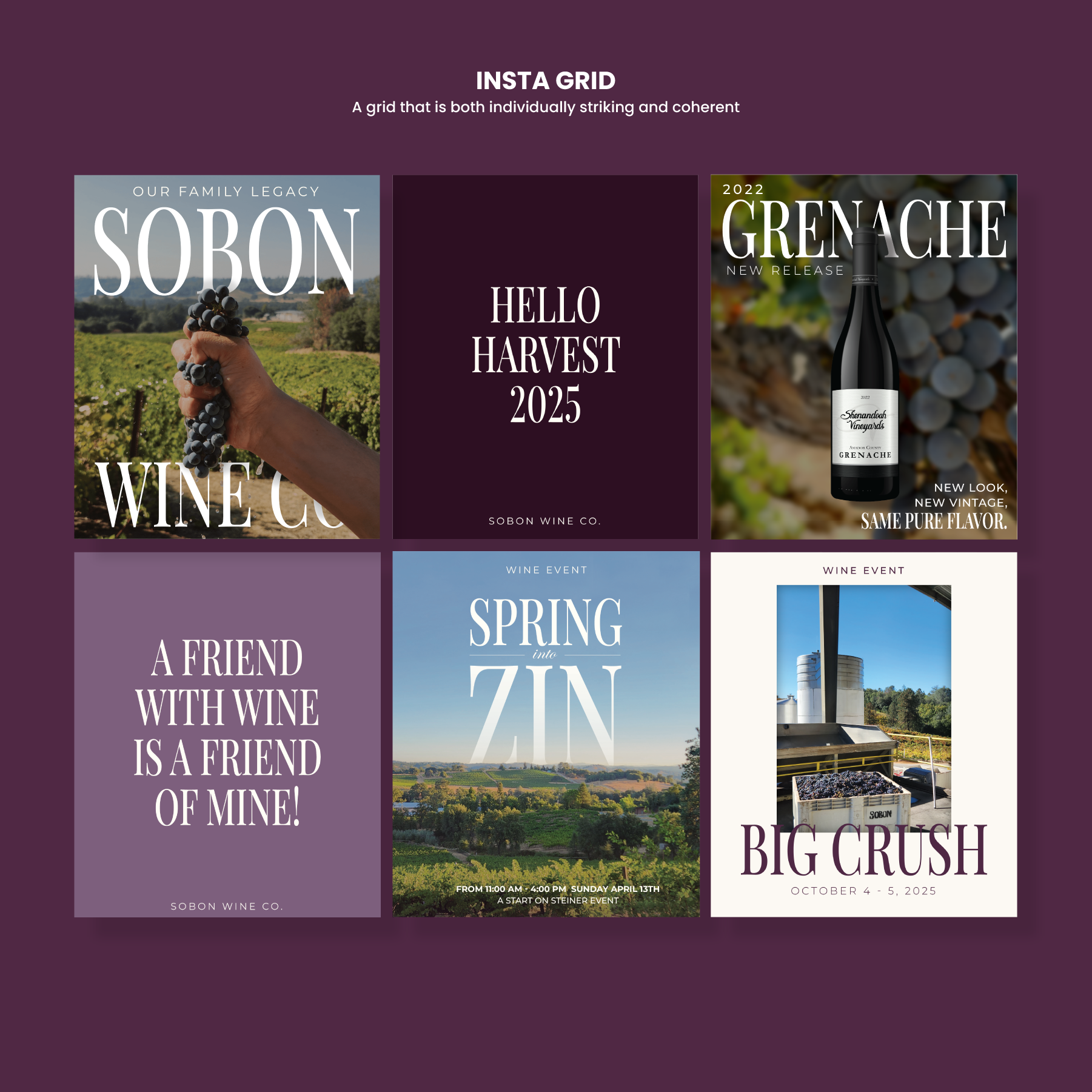
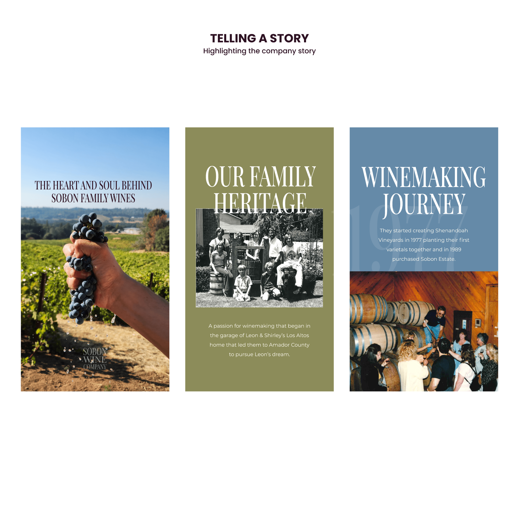
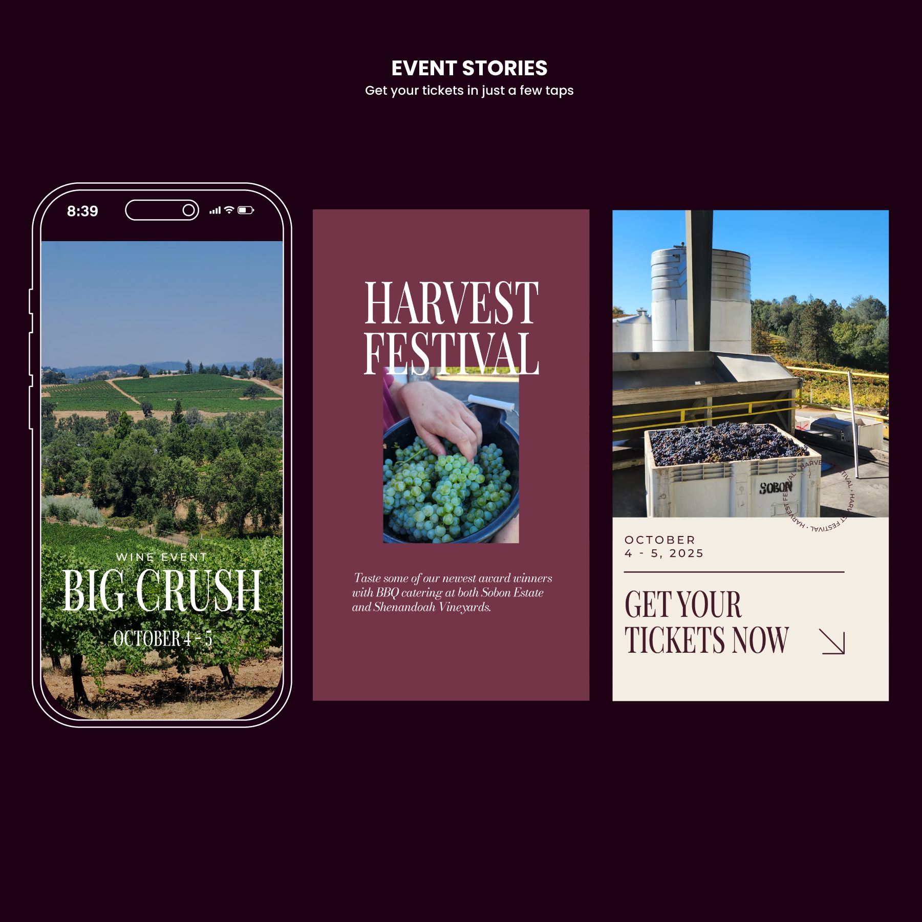
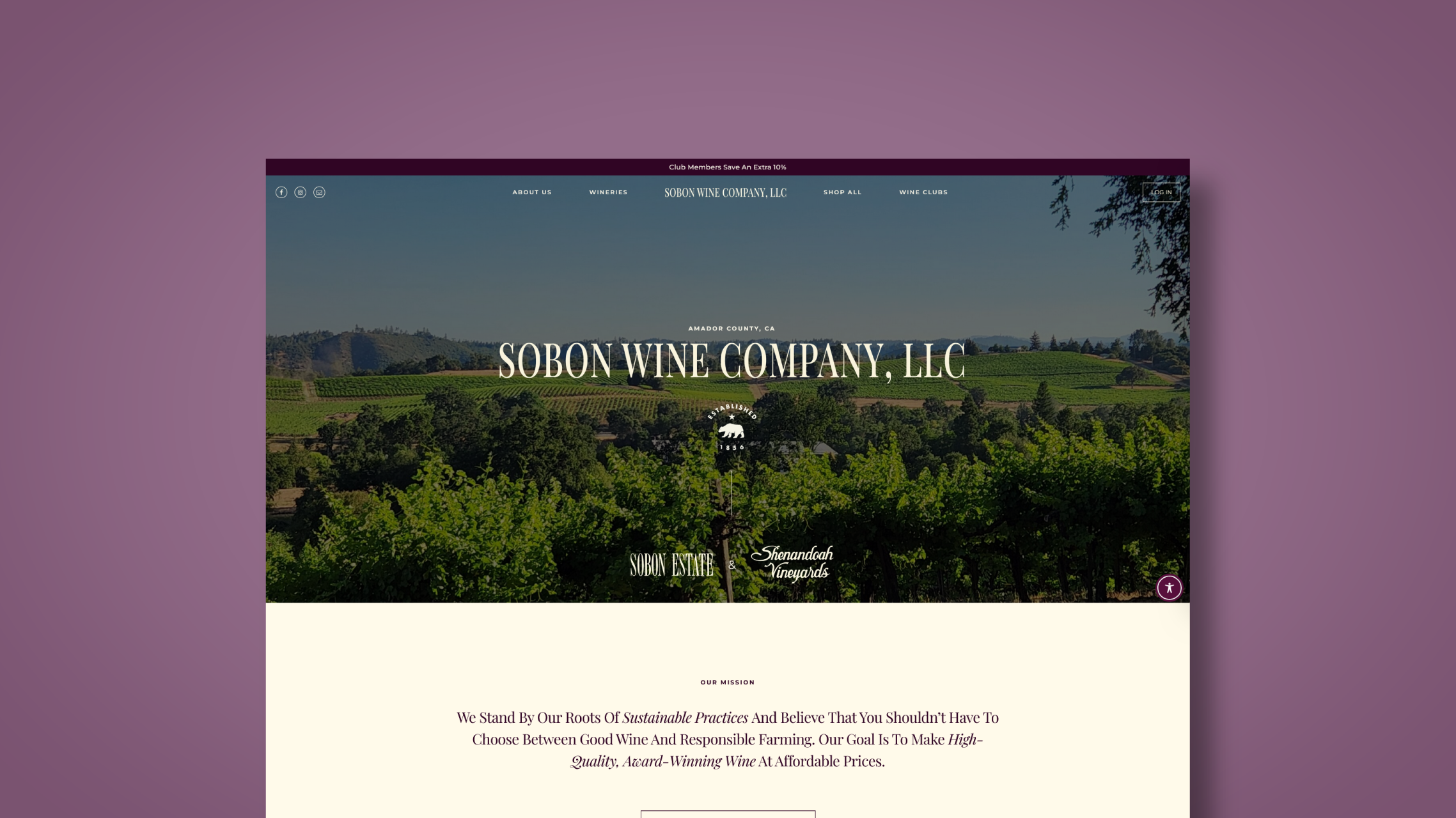
I combed through Instagram and Facebook to find company pages that were well designed. I collected screenshots and notes on their Profile Pictures, Bios, Grid Layout, and Highlights. I also compiled a moodboard of graphic designs for social media with fonts, colors, and layouts that I thought reflected the historical and classy air of Sobon Wine.

Designing

I whittled down the fonts to Montserrat and Playfair Display. These two fonts I felt went with all of the logos that the company uses for their three brands (Sobon Wine Company, Sobon Estate, and Shenandoah Vineyards). The biggest obstacle was trying to find a way to tie all these logos together with one visual identity under the umbrella company. Most customers don’t know that Sobon Estate and Shenandoah Vineyards are both owned by Sobon Wine Company and my goal was to try and make that more obvious by creating the one visual identity to represent all of them. The colors were easier since I already knew what shade of purple I needed to use. There is a fourth brand that Sobon Wine uses for it’s higher end wines called The ReZerve® that they mark with a purple capsule and a light-yellow and purple label. These colors I carried over to the creation of the visual identity and expanded from there.

Final Design

The visual identity I created for the company originally has served me well as their designer since it has sped up the graphic design process greatly. I still make tweaks to it every time I finish a 9 post template grid to make sure that the design is still fresh and functional. 
Designed & Developed By Me
Orange County, CA
© 2025 Erika Nordman
homearrow-right